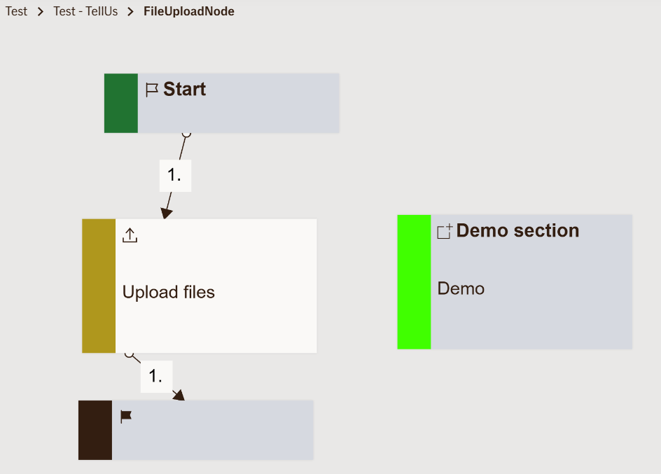
File Upload Node
The File Upload Node allows users to attach one or multiple files within the flow.
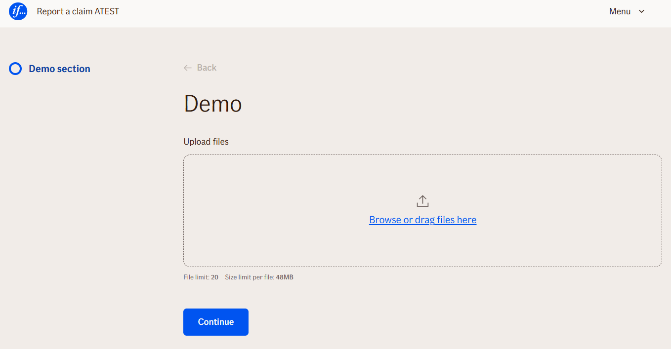
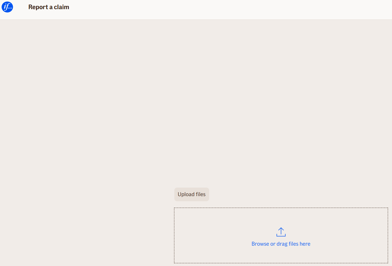
It renders a user interface to select or drag-and-drop files and validates them according to the defined restrictions (file type, size, and count).
Use Case
Use the File Upload Node when:
- You need users to submit documents such as insurance policies, identity proof, images, or claims forms.
- Collecting attachments is part of a form-based TellUs flow.
- You want to enforce file validations before processing or sending files to backend systems.
Example scenarios:
- Upload scanned policy documents for a property insurance claim.
- Attach supporting medical documentation for a health insurance claim.
- Users provide photos or videos of an accident for claim evaluation.
When not to use:
Do not use for collecting textual input — use Input Text Nodes instead.
UI Examples
- TellUs
- WebChat
Behavior
- Blocking: Yes — user must complete file upload to proceed.
- Requires user input: Yes.
- If no input is provided: Validation error is shown and user cannot continue.
- Outputs variables: Yes — uploaded files and their metadata can be accessed in later nodes.
- Validations enforced: File type, file size, file count, and empty files.
Node Metadata
| Property | Description |
|---|---|
| Node class | FileUploadNode |
| MessageType | 10 |
| CanBeEdited | False |
| CanBeProcessedOnce | False |
| RequireUserResponse | Yes |
Input Properties
| Property | Description |
|---|---|
| HeaderText | The title or instruction displayed above the file upload field. Guides users on what to upload.
|
| uploadFilesButtonText | The text shown on the button to start uploading selected files.
|
| uploadInProgressButtonText | The text displayed on the button while the upload is in progress.
|
| browseFilesButtonText | The text on the button allowing users to browse files from their device.
|
| dropZoneContainerText | Instruction text displayed in the drag-and-drop area for uploading files.
|
| uploadFailedErrorMessage | The message displayed if the file upload fails.
|
| allowedFileExtensions | Comma-separated list of accepted file types for upload. Ensures only valid file formats are submitted.
|
| fileTypeErrorMessage | Error message displayed when a user tries to upload a file with an unsupported type.
|
| maxFileSizeInBytes | Maximum allowed file size in bytes for each uploaded file.
|
| fileSizeErrorMessage | Error message displayed when a file exceeds the maximum allowed size.
|
| fileEmptyErrorMessage | Error message displayed if a user attempts to upload an empty file.
|
| maxFileCount | Maximum number of files that can be uploaded in a single node instance.
|
| fileCountErrorMessage | Error message displayed when a user tries to upload more files than allowed.
|
| defaultValidationMessage | The default error message shown when the input is invalid or missing. This is used if no custom validation message is provided.
|
| sectionId | Groups this node visually under a specific section in TellUs. When multiple nodes share the same |
| defaultValue | The initial value that is prefilled into the input field when the node is rendered. Useful for suggesting defaults or pre-populating known data. |
| isRequired | Determines whether the user must provide a value before continuing. If set to
|
| isRequiredValidationMessage | The error message shown when a required field is left empty. This overrides the default validation message when
|
Output Properties
| Property | Description |
|---|---|
| UploadedFiles | Array of uploaded file objects including metadata such as name, type, and size. |
| UploadedFileList | A list of file names uploaded by the user. |
| UploadedFileData | Encoded or raw content of the uploaded files, usable in downstream nodes. |
| displayValue | A user-friendly string summarizing uploaded files, often shown in UI. |
Editor Example
This link opens a prebuilt flow using this node in context. You can inspect how it's configured, how it's connected, and how it behaves in a real editor environment.