Input Choice From Carousel Node
The InputChoiceFromCarouselNode lets you show a list of items that the customer has already added using a Carousel Node, and then ask them to choose one from that list.
Use Case
Use InputChoiceFromCarousel node when you want the customer to select one item from a group they’ve already entered. For example:
- The customer adds several injured persons using a Carousel Node.
- You then ask, “Who is the main policyholder?” and show the list of added persons for them to choose from.
This keeps the form dynamic and personalized, based on what the customer has already entered.
UI Examples
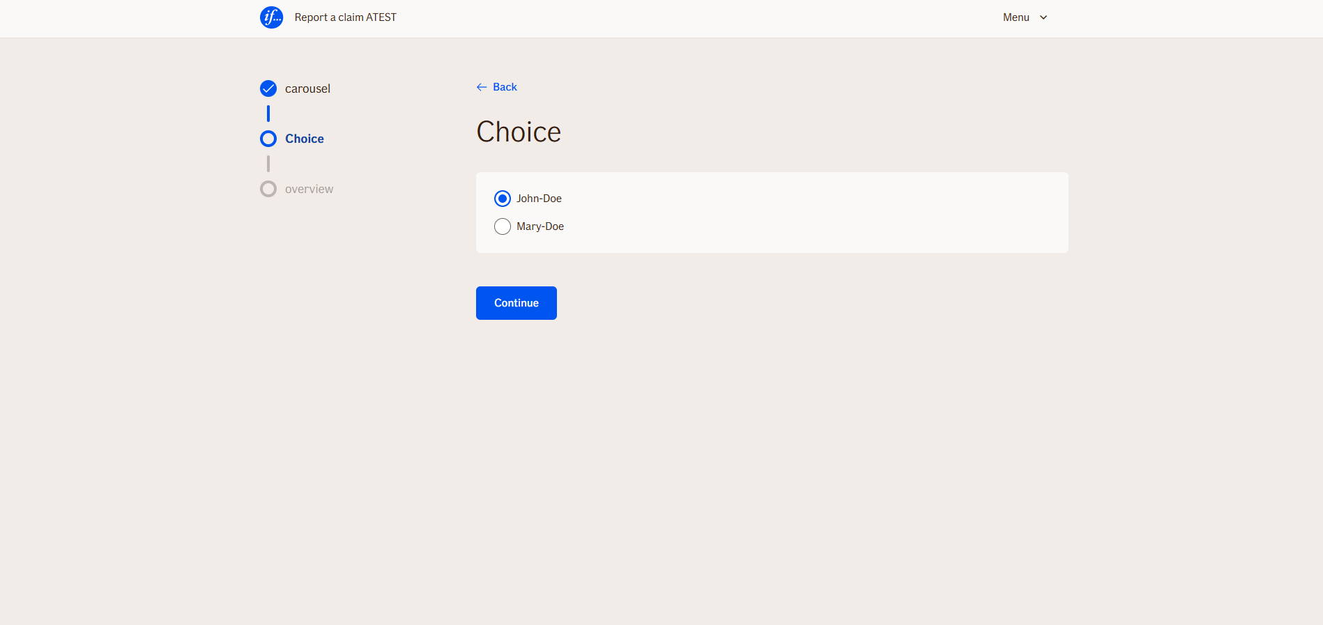
- TellUs
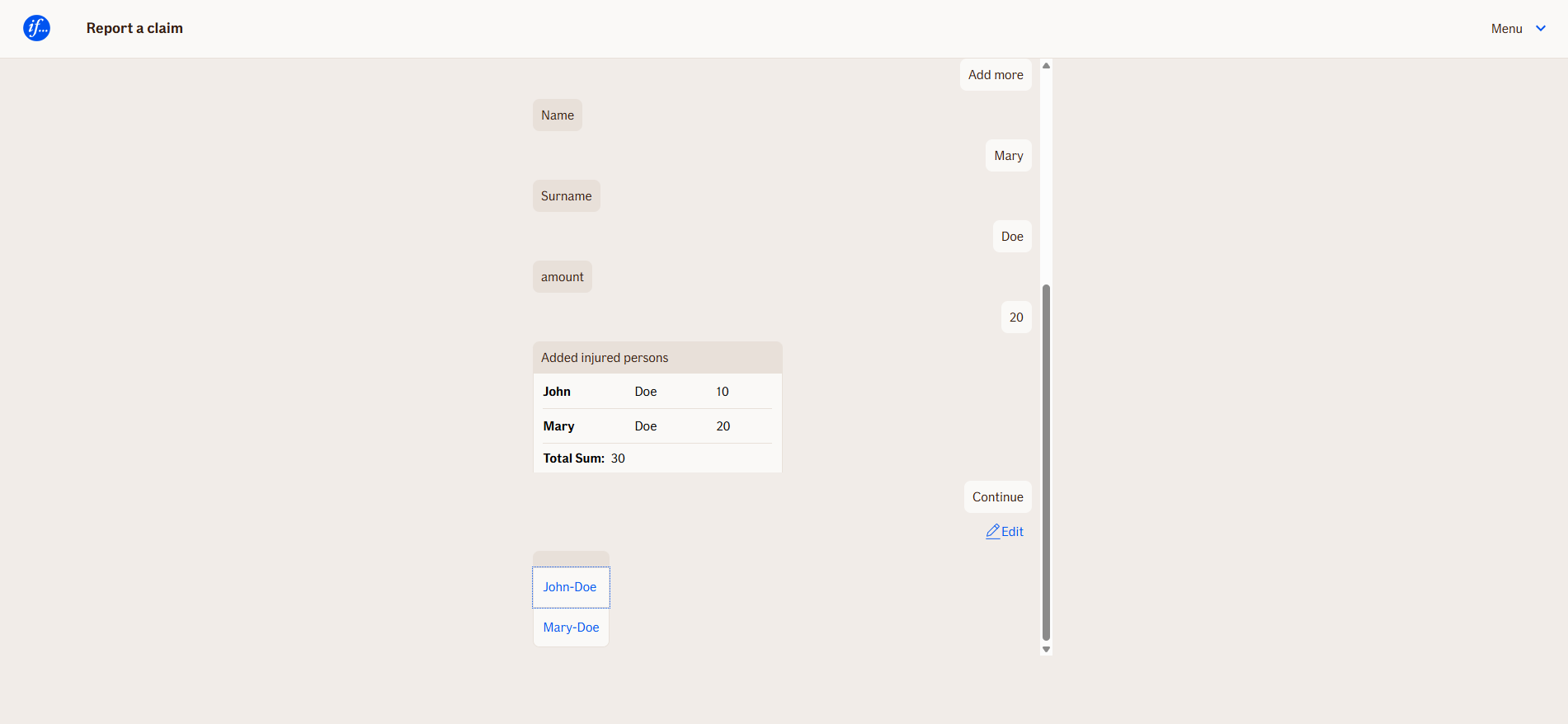
- WebChat
Behavior
When items are added in Carousel, specific inputs can be displayed in input choice list.
Node Metadata
| Property | Description |
|---|---|
| Node class | InputChoiceFromCarouselNode |
| MessageType | 22 |
| CanBeEdited | True |
| CanBeProcessedOnce | False |
| RequireUserResponse | Yes |
Input Properties
| Property | Description |
|---|---|
| carouselNodeName | Carousel variable name (without brackets). |
| listItemDisplayPattern | Nodes from Carousel we want to display as input choice labels (with brackets). Multiple nodes can be used here. E.g. [name] [surname]
|
| defaultValidationMessage | The default error message shown when the input is invalid or missing. This is used if no custom validation message is provided.
|
| sectionId | Groups this node visually under a specific section in TellUs. When multiple nodes share the same |
| defaultValue | The initial value that is prefilled into the input field when the node is rendered. Useful for suggesting defaults or pre-populating known data. |
| isRequired | Determines whether the user must provide a value before continuing. If set to
|
| isRequiredValidationMessage | The error message shown when a required field is left empty. This overrides the default validation message when
|
Output Properties
No output properties.
Editor Example
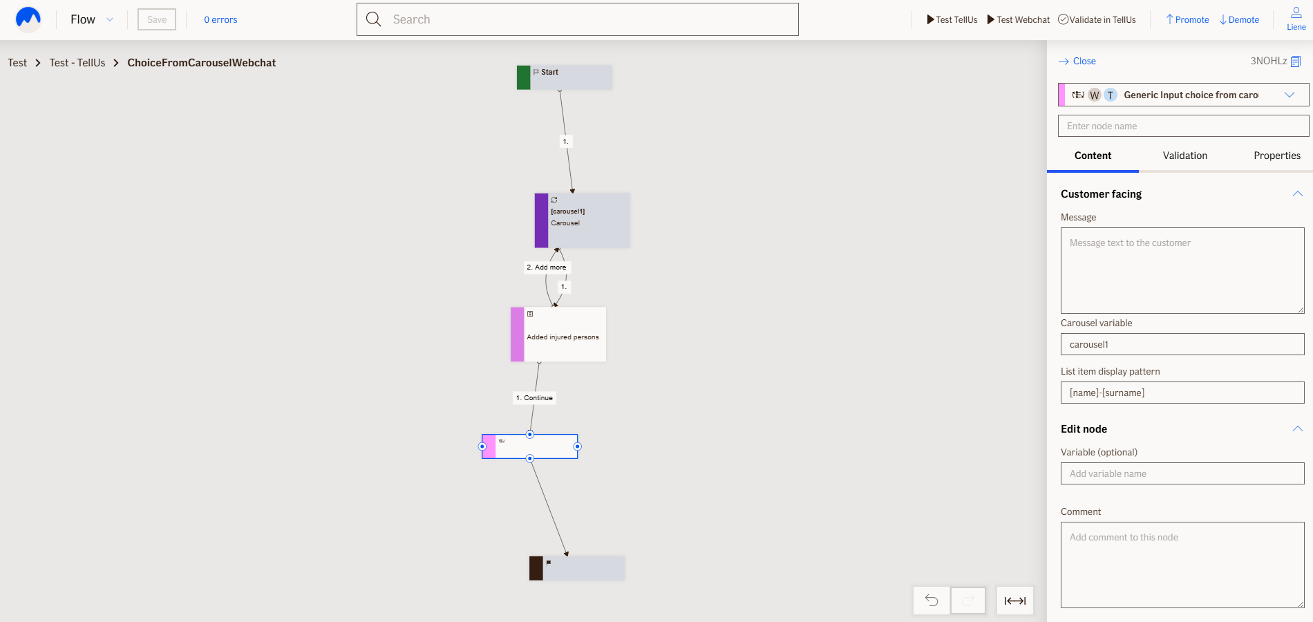
Try it in the Atlas Editor for TellUs Try it in the Atlas Editor for Webchat
This link opens a prebuilt flow using this node in context. You can inspect how it's configured, how it's connected, and how it behaves in a real editor environment.