Input Choice Node
What it does
Presents the user with a list of selectable options, displayed as radio buttons.
Each option corresponds to an outgoing branch from the node, allowing the flow to continue along the path chosen by the user.
This node is typically used when the conversation needs to gather a clear, single-choice decision from the user — for example, selecting an insurance category, confirming an action, or choosing between predefined paths.
Use Case
When to use this node
Use the Input Choice Node when you want to present multiple mutually exclusive options to the user and branch the flow depending on their selection.
It provides a simple and intuitive way to capture user intent in structured form.
Typical examples include:
- Asking the user to choose between “Yes” or “No”
- Offering multiple service types (e.g., “Rental insurance”, “Property insurance”, “Different insurance”)
- Presenting menu-style navigation options within a conversation
Avoid using this node when:
- You want users to select multiple options use a multiple choice node.
UI Examples
- TellUs
- WebChat
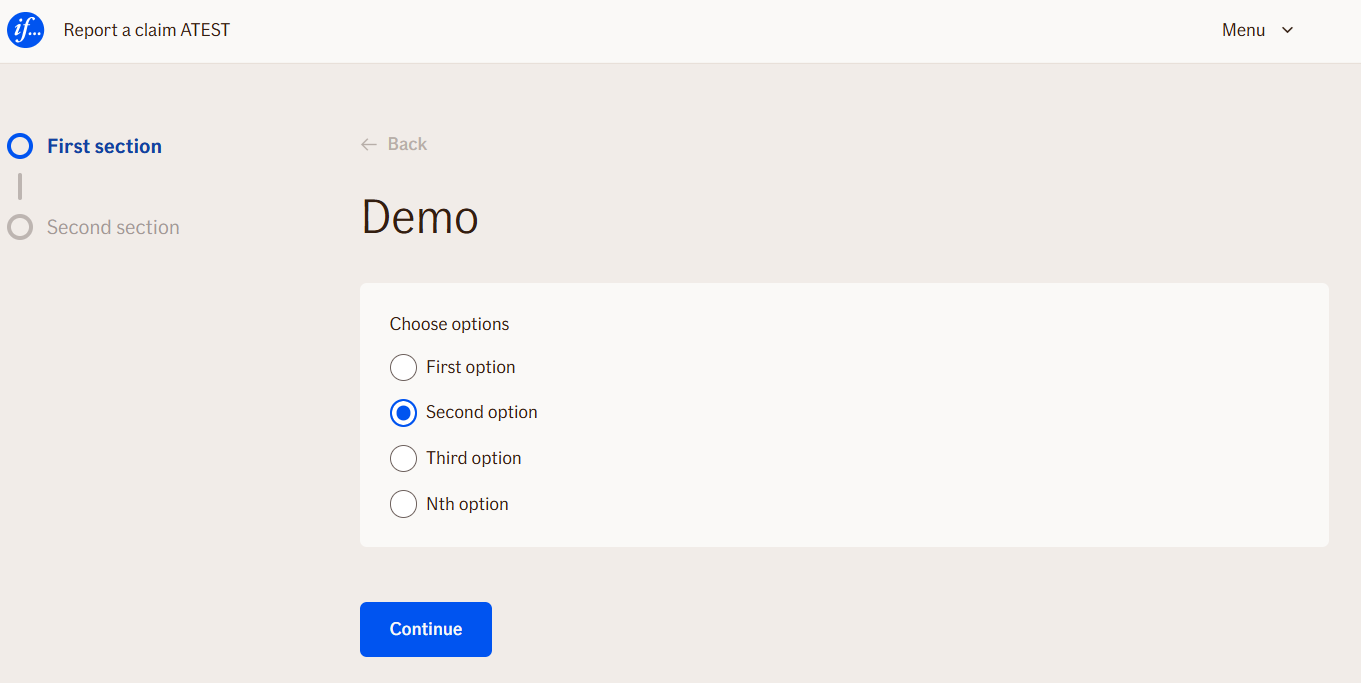
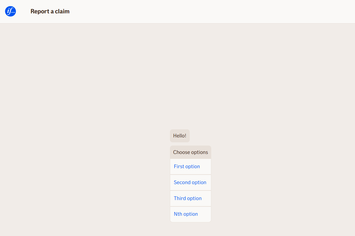
Behavior
List the behavioral characteristics
- Blocking: ✅ Yes — the flow pauses until the user selects one of the options.
- User input required: ✅ Yes — the user must choose an option before the conversation continues.
- No input provided: The node remains active until a valid selection is made.
- Validations: Automatic validation ensures only one option can be selected (radio behavior).
- Option handling:
- Each outgoing branch from the Choice Node becomes one selectable option in the UI.
- The option label is derived from the branch’s value set in the editor.
- When the user makes a choice, the flow immediately continues along the corresponding branch.
Node Metadata
| Property | Description |
|---|---|
| Node class | InputChoiceNode |
| MessageType | 3 |
| CanBeEdited | True |
| CanBeProcessedOnce | False |
| RequireUserResponse | Yes |
Input Properties
| Property | Description |
|---|---|
| defaultValidationMessage | The default error message shown when the input is invalid or missing. This is used if no custom validation message is provided.
|
| sectionId | Groups this node visually under a specific section in TellUs. When multiple nodes share the same |
| defaultValue | The initial value that is prefilled into the input field when the node is rendered. Useful for suggesting defaults or pre-populating known data. |
| isRequired | Determines whether the user must provide a value before continuing. If set to
|
| isRequiredValidationMessage | The error message shown when a required field is left empty. This overrides the default validation message when
|
Output Properties
No output properties.
Editor Example
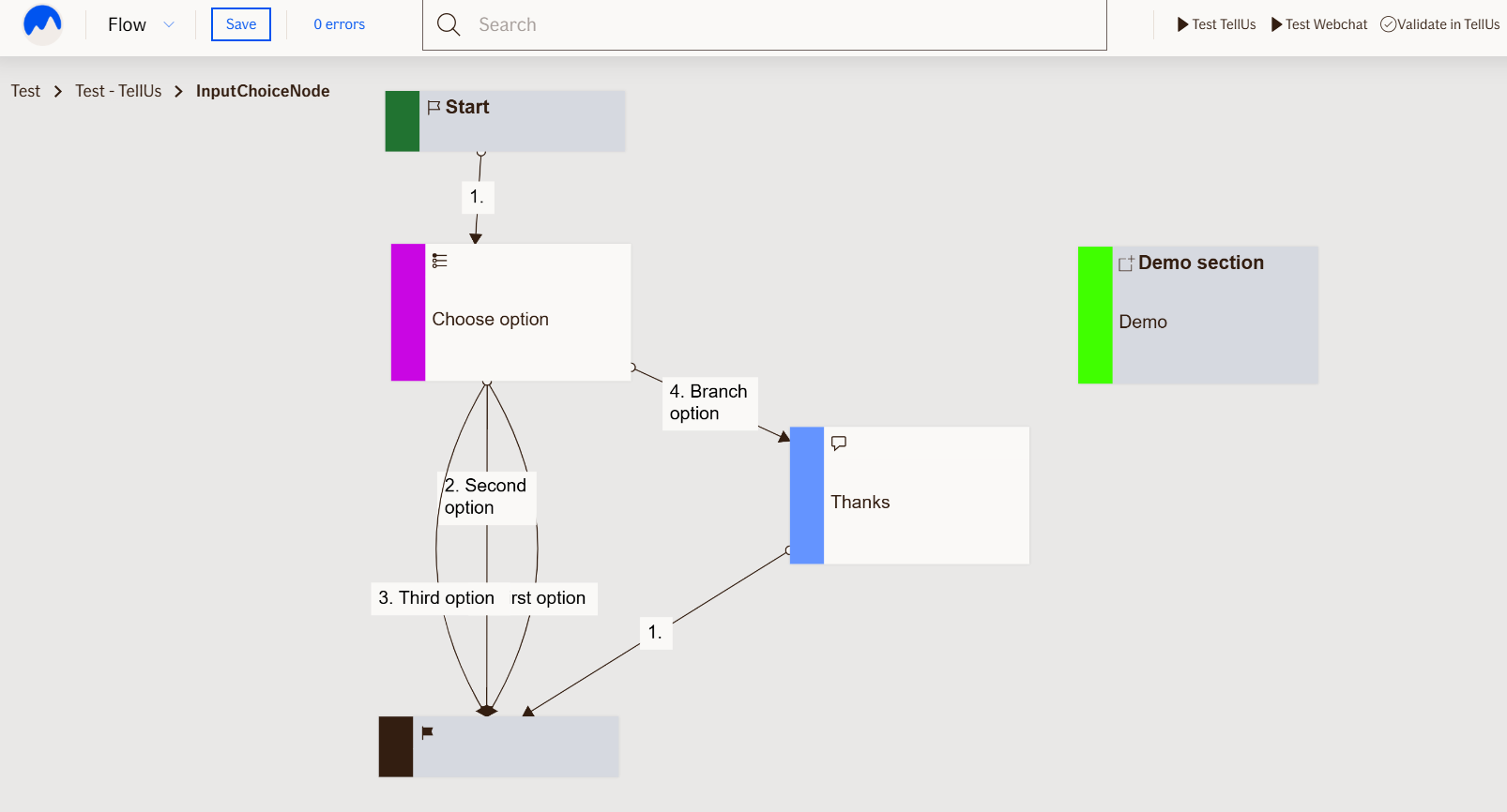
This link opens a prebuilt flow using this node in context. You can inspect how it's configured, how it's connected, and how it behaves in a real editor environment.