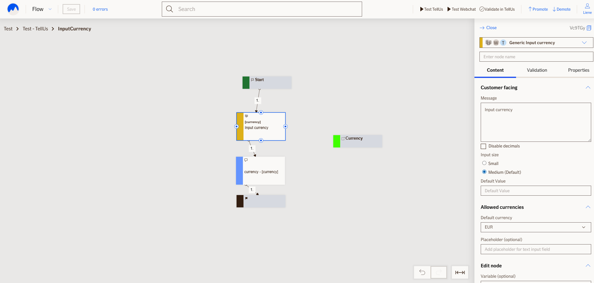
Input Currency Node
The InputCurrencyNode adds a field where users can enter an amount of money. It clearly shows which currency the amount should be in (like EUR, USD, etc.), so there's no confusion.
Only numbers are allowed, and users can also use commas if needed (e.g., "1,000").
Use Case
Use the InputCurrencyNode when you need to collect money-related values in a clear and consistent way—such as:
-Amount paid
-Value of lost goods
-Vet bills or other expenses
It helps make sure users enter the right kind of data and know which currency to use.
UI Examples
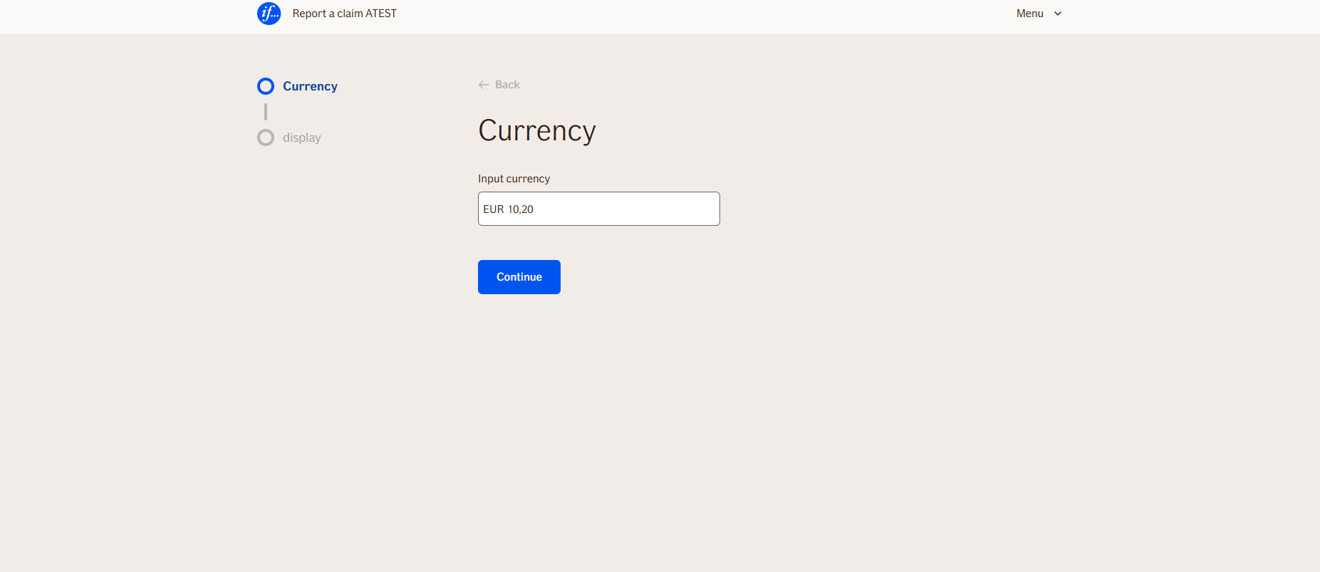
- TellUs
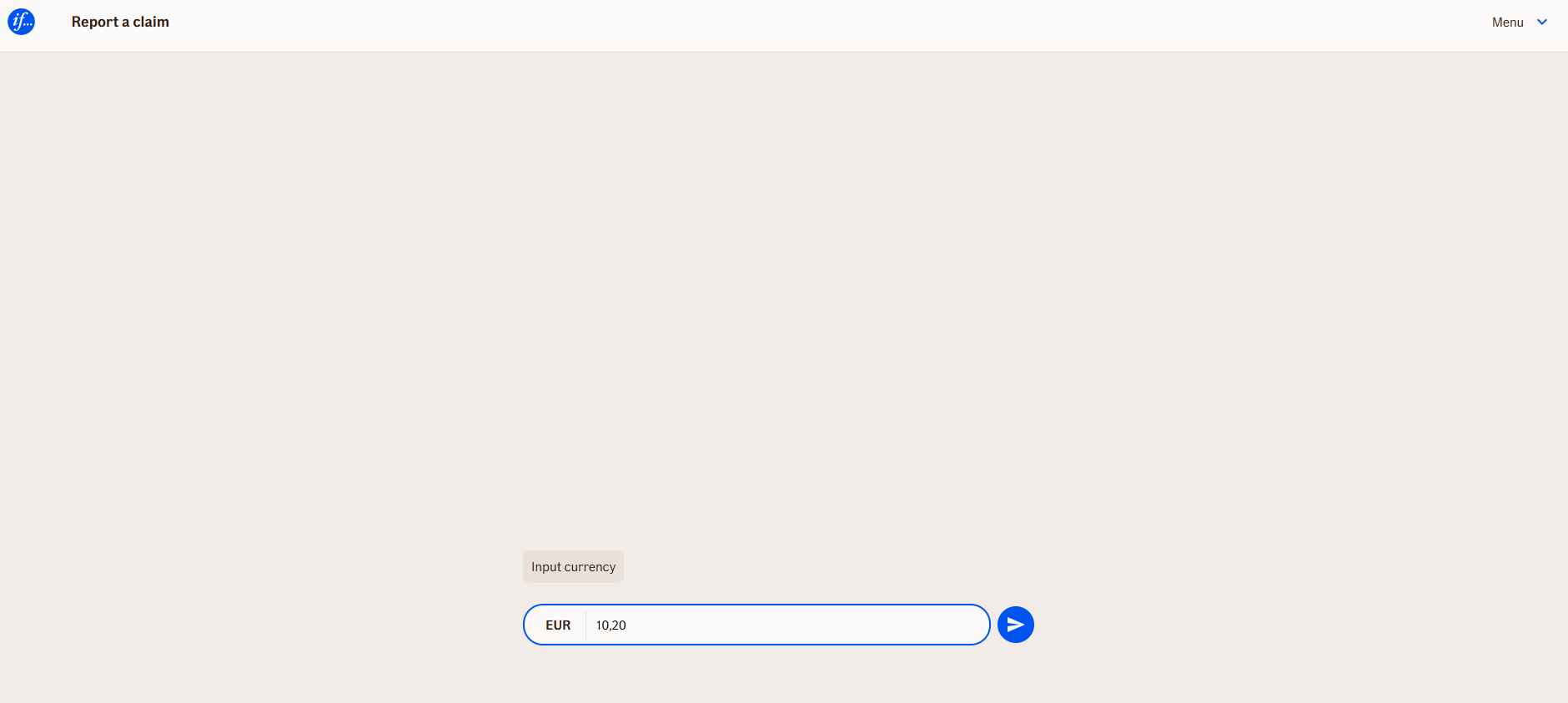
- WebChat
Behavior
- Blocking: The node waits for the user to type and submit a response
- Produces output: Stores the input in output variable
- Renders: currency label, combined with input field
- Supports validation: Can be marked as required/optional.
- Moves to the next node: After user submission
Node Metadata
| Property | Description |
|---|---|
| Node class | InputCurrencyNode |
| MessageType | 26 |
| CanBeEdited | True |
| CanBeProcessedOnce | False |
| RequireUserResponse | Yes |
Input Properties
| Property | Description |
|---|---|
| Placeholder | Placeholder of expected value mask. E.g. 12,50 |
| DefaultCurrency | Pre selected currency label, that is expected in current flow.
|
| maxLengthValidationMessage | Errro message when amount exceeds max length.
|
| DisableDecimals | When enabled (checked) only whole numbers are allowed. By default disabled, allowing decimals.
|
| InputSize | Size of the input field.
|
| defaultValidationMessage | The default error message shown when the input is invalid or missing. This is used if no custom validation message is provided.
|
| sectionId | Groups this node visually under a specific section in TellUs. When multiple nodes share the same |
| defaultValue | The initial value that is prefilled into the input field when the node is rendered. Useful for suggesting defaults or pre-populating known data. |
| isRequired | Determines whether the user must provide a value before continuing. If set to
|
| isRequiredValidationMessage | The error message shown when a required field is left empty. This overrides the default validation message when
|
Output Properties
No output properties.
Editor Example
This link opens a prebuilt flow using this node in context. You can inspect how it's configured, how it's connected, and how it behaves in a real editor environment.