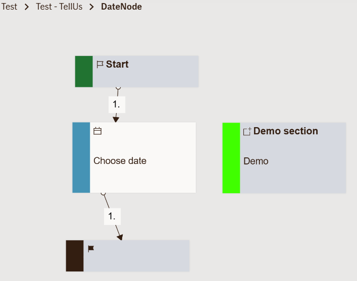
Input Date Node
The Input Date Node displays a date picker that allows the user to select a specific date within defined limits.
It’s typically used to collect dates relevant to claims, policies, or customer details — for example, incident date, policy start date, or date of birth.
Once the user selects a date and confirms, the chosen value is stored and made available as an output variable for use later in the flow.
Use Case
Use the Input Date Node whenever you need the user to provide a date input in a structured and validated way.
Typical examples in an insurance context include:
- Asking for the accident date when submitting a motor claim
- Selecting a travel start or end date for travel insurance
- Capturing the policy renewal date or contract start date
- Recording a date of service for medical or repair claims
Avoid using this node for non-date data (like timestamps or text-based schedules) — those should be handled by text or specialized input nodes instead.
UI Examples
- TellUs
- WebChat
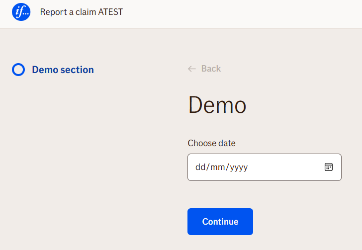
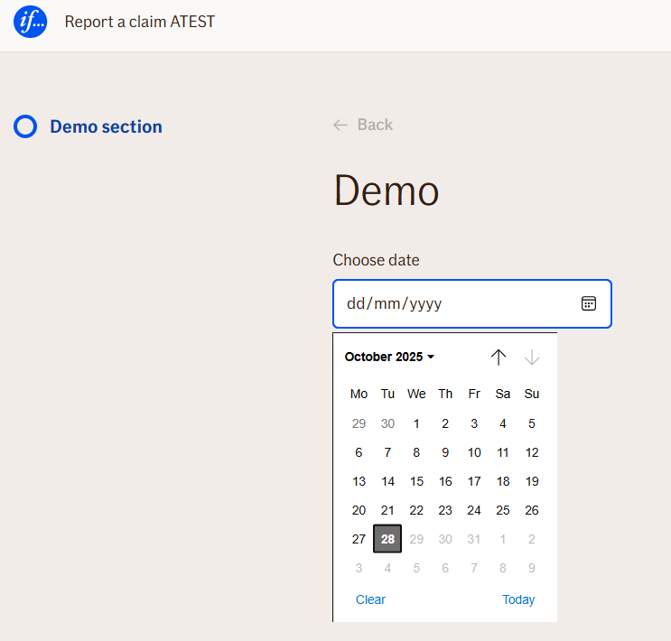
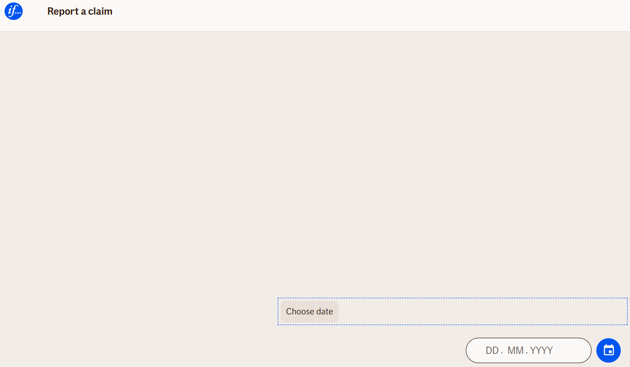
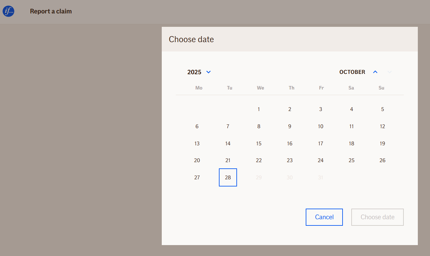
Behavior
- Blocking: ✅ Yes — the flow waits until the user selects and confirms a date.
- User input required: ⚙️ Configurable with
isRequired. - Validation: Automatically checks for correct date format and whether the chosen date falls within defined limits (
minimumPeriodandmaximumPeriod). - Output variables: The selected date is stored and accessible later in the flow.
- Date limits: You can control allowed ranges (e.g., only past dates, or only future dates) via
dateAvailabilityType. - Formatting: The display format (e.g.,
dd.mm.yyyy,mm/dd/yyyy) can be customized usingdatePreset.
Node Metadata
| Property | Description |
|---|---|
| Node class | InputDateNode |
| MessageType | 4 |
| CanBeEdited | True |
| CanBeProcessedOnce | False |
| RequireUserResponse | Yes |
Input Properties
| Property | Description |
|---|---|
| minimumPeriod | Defines the earliest selectable date relative to the current date. Can be used to prevent selecting dates too far in the past (e.g., only allow claims from the last 12 months). You can also reference already entered date. |
| maximumPeriod | Defines the latest selectable date relative to the current date. Useful for disallowing future dates, such as when recording past events. You can also reference already entered date. |
| confirmButton | The label text of the button used to confirm the selected date. Defaults to “Choose date” or “OK” depending on locale.
|
| datePreset | Determines the format in which the date is displayed and entered. Allows consistency across different markets (e.g.,
|
| dateAvailabilityType | Defines what range of dates can be selected by the user — such as past, future, or all dates.
|
| yearMask | The display mask for the year portion of the date field. Localized for different languages (e.g.,
|
| monthMask | The display mask for the month portion of the date field (e.g.,
|
| dayMask | The display mask for the day portion of the date field (e.g.,
|
| defaultValidationMessage | The default error message shown when the input is invalid or missing. This is used if no custom validation message is provided.
|
| sectionId | Groups this node visually under a specific section in TellUs. When multiple nodes share the same |
| defaultValue | The initial value that is prefilled into the input field when the node is rendered. Useful for suggesting defaults or pre-populating known data. |
| isRequired | Determines whether the user must provide a value before continuing. If set to
|
| isRequiredValidationMessage | The error message shown when a required field is left empty. This overrides the default validation message when
|
Output Properties
| Property | Description |
|---|---|
| userInputValue | The date value selected by the user, formatted according to
|
| displayValue | The user-friendly formatted version of the selected date, matching what the customer saw in the interface. |
Editor Example
This link opens a prebuilt flow using this node in context. You can inspect how it's configured, how it's connected, and how it behaves in a real editor environment.