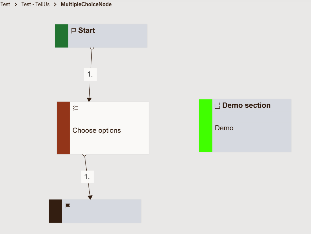
Input Multiple Choice Node
Displays a list of selectable options where the user can choose one or more values.
Unlike the regular Choice Node, this node supports multiple selections, allowing the user to provide broader, more flexible input.
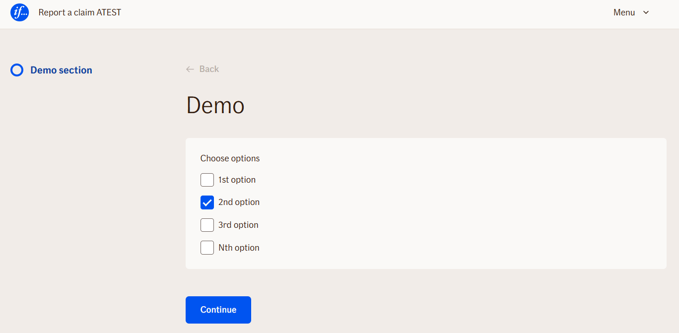
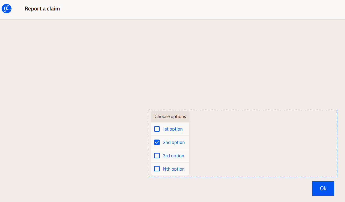
The options are displayed as checkboxes. Once the user makes their selections and submits, the conversation continues with the chosen values stored as output variables.
Use Case
Use the Input Multiple Choice Node when you need to gather more than one selection from the user.
It’s ideal for cases where several items, preferences, or coverage types can apply simultaneously.
Typical examples include:
- Asking the user which insurance types they currently hold: “Home”, “Car”, “Travel”, “Health”
- Letting a customer select optional coverages (e.g., “Glass protection”, “Roadside assistance”, “Legal aid”)
- Gathering information on multiple affected assets in a claim (e.g., “Car”, “Bicycle”, “Electronics”)
- Offering several communication preferences, such as “SMS updates”, “Email updates”, “Phone call”
Avoid using this node when:
- Only one answer should be possible — in that case, use the Choice Node
UI Examples
- TellUs
- WebChat
Behavior
- Blocking: ✅ Yes — the flow pauses until the user completes the selection.
- User input required: ⚙️ Optional — can be configured to allow skipping if no choices apply.
- No input provided: The node remains active or moves on, depending on configuration.
- Output variables: ✅ Yes — the selected options are stored as an array (or comma-separated list) and can be accessed later in the flow.
- Input method: User clicks checkboxes corresponding to available options and confirms with a “Continue” or “Submit” button.
Editor Behavior
-
Adding options:
In the side panel, under the Choices section, click “Add option” and fill in the value you want to display.
Each option represents one selectable item in the UI. -
Option customization:
- Option text defines what the user sees.
- Option values are what get stored in the output variable.
- You can freely reorder, rename, or remove options in the editor.
-
Preview:
The node preview displays all configured options as checkboxes, helping you visualize the end-user experience directly in the editor. -
Output handling:
The collected selections can be referenced in later nodes using variable syntax, for example:
[userChoices.displayValue]
Node Metadata
| Property | Description |
|---|---|
| Node class | InputMultipleChoiceNode |
| MessageType | 17 |
| CanBeEdited | True |
| CanBeProcessedOnce | False |
| RequireUserResponse | Yes |
Input Properties
| Property | Description |
|---|---|
| item | n/a |
| splitChar | The selected options are stored as an array later they are joined using configured character.
|
| defaultButton | Label that is displayed on the button that is clicked to approve selection and continue with the flow.
|
| defaultValidationMessage | The default error message shown when the input is invalid or missing. This is used if no custom validation message is provided.
|
| sectionId | Groups this node visually under a specific section in TellUs. When multiple nodes share the same |
| defaultValue | The initial value that is prefilled into the input field when the node is rendered. Useful for suggesting defaults or pre-populating known data. |
| isRequired | Determines whether the user must provide a value before continuing. If set to
|
| isRequiredValidationMessage | The error message shown when a required field is left empty. This overrides the default validation message when
|
Output Properties
| Property | Description |
|---|---|
| item |
|
| code |
|
| codes |
|
| Count |
|
| displayValue | Selected values joined with the |
Editor Example
This link opens a prebuilt flow using this node in context. You can inspect how it's configured, how it's connected, and how it behaves in a real editor environment.