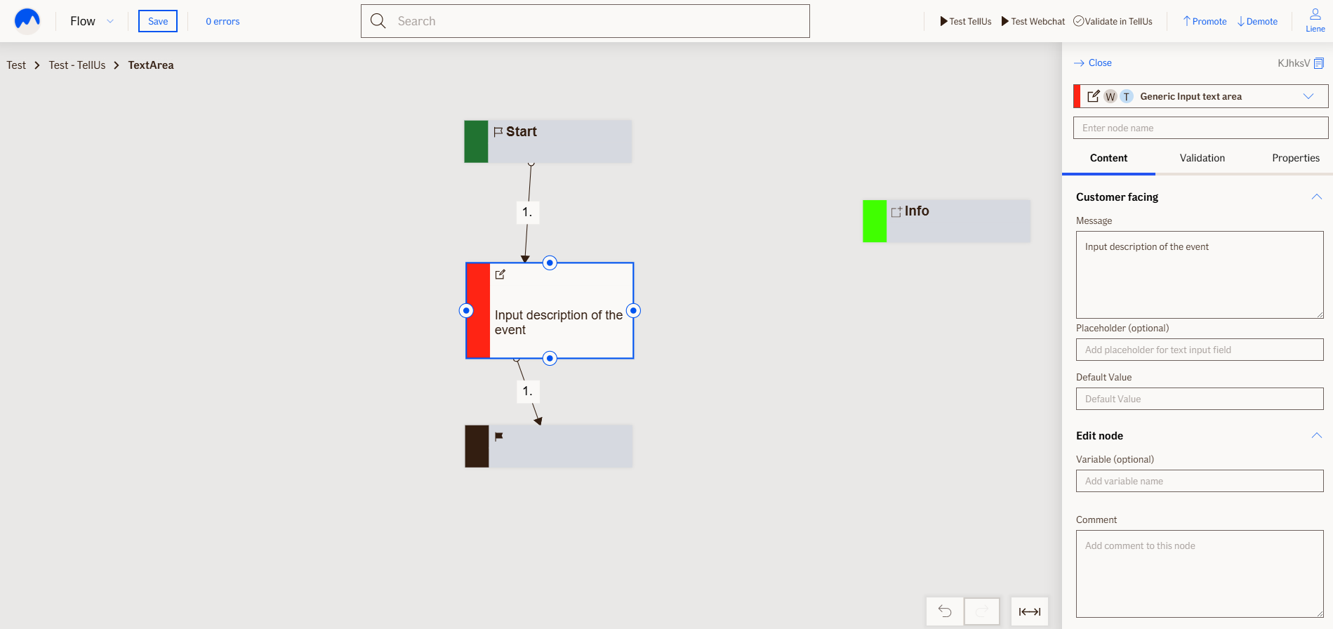
Input Text Area Node
The InputTextAreaNode displays a message to the user and then waits for a free-text response. It is used to collect larger input such as descriptions of the event.
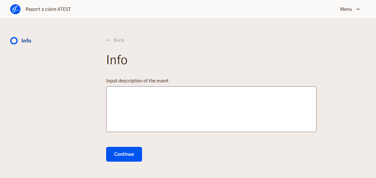
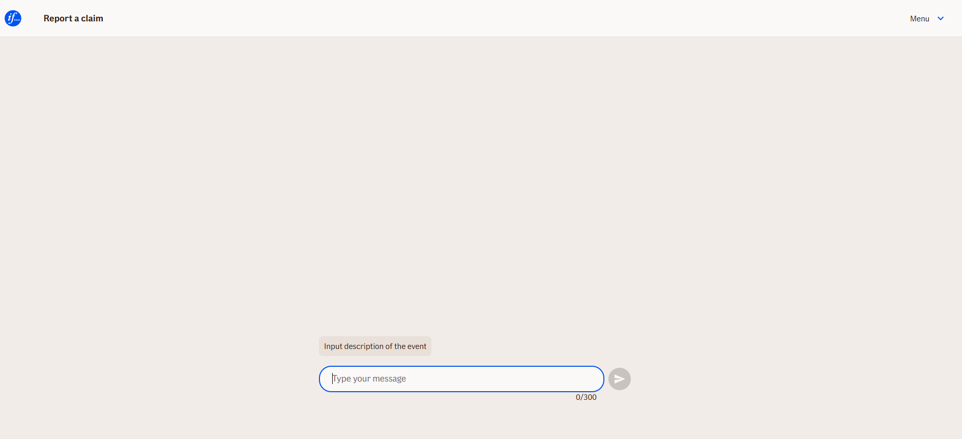
In WebChat, it appears as a chatbot message followed by a text area input field. In TellUs, the message is shown above a text area input element. The node pauses the flow until the user provides input and submits it.
Use Case
Use the InputTextAreaNode when you need to:
- Collect long, free-form user input
- Prompt the user with a simple text-based question
- Capture a value that will be used later in the flow (e.g., for summaries, conditions, or API calls)
UI Examples
- TellUs
- WebChat
Behavior
- Blocking: The node waits for the user to type and submit a response
- Produces output: Stores the input in a configured output variable
- Renders differently depending on UI:
- WebChat: message + input field in the chat stream
- TellUs: label and text area input within the form layout
- Supports validation: Can be marked as required or constrained by length/pattern
- Moves to the next node after user submission
Node Metadata
| Property | Description |
|---|---|
| Node class | InputTextAreaNode |
| MessageType | 20 |
| CanBeEdited | True |
| CanBeProcessedOnce | False |
| RequireUserResponse | Yes |
Input Properties
| Property | Description |
|---|---|
| toUpperCase | If set to
|
| removeWhiteSpaces | If enabled, all whitespace characters (spaces, tabs, etc.) will be removed from the input value before it is stored.
|
| placeholder | Text shown inside the input field before the user types anything. It provides a hint about what should be entered.
|
| maxLengthValidationMessage | The error message shown when the user input exceeds the allowed number of characters. This message overrides the default if set.
|
| inputSize | Controls the visual size of the input field. This does not limit text length, but adjusts the display space in the UI.
|
| defaultValidationMessage | The default error message shown when the input is invalid or missing. This is used if no custom validation message is provided.
|
| sectionId | Groups this node visually under a specific section in TellUs. When multiple nodes share the same |
| defaultValue | The initial value that is prefilled into the input field when the node is rendered. Useful for suggesting defaults or pre-populating known data. |
| isRequired | Determines whether the user must provide a value before continuing. If set to
|
| isRequiredValidationMessage | The error message shown when a required field is left empty. This overrides the default validation message when
|
Output Properties
No output properties.
Editor Example
This link opens a prebuilt flow using this node in context. You can inspect how it's configured, how it's connected, and how it behaves in a real editor environment.