Input Text Node
The InputTextNode displays a message to the user and then waits for a free-text response. It is used to collect simple input such as names, short answers, or identifiers.
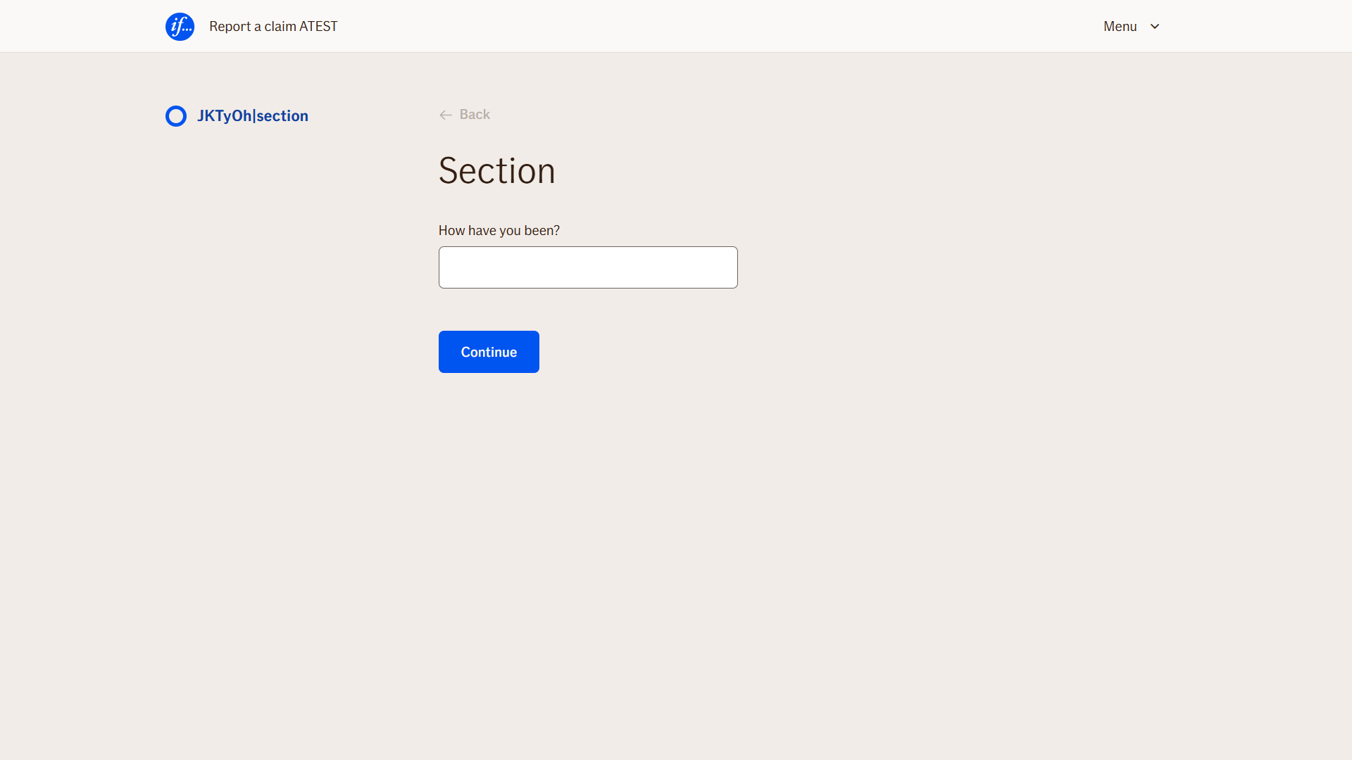
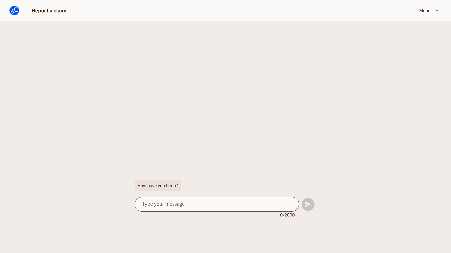
In WebChat, it appears as a chatbot message followed by a text input field. In TellUs, the message is shown above a text input element. The node pauses the flow until the user provides input and submits it.
Use Case
Use the InputTextNode when you need to:
- Collect short, free-form user input (e.g., name, reason, reference number)
- Prompt the user with a simple text-based question
- Capture a value that will be used later in the flow (e.g., for summaries, conditions, or API calls)
It is typically placed after an instructional message or at the beginning of a data collection step.
UI Examples
- TellUs
- WebChat
Behavior
- Blocking: The node waits for the user to type and submit a response
- Produces output: Stores the input in a configured output variable
- Renders differently depending on UI:
- WebChat: message + input field in the chat stream
- TellUs: label and text input within the form layout
- Supports validation: Can be marked as required or constrained by length/pattern
- Moves to the next node after user submission
Node Metadata
| Property | Description |
|---|---|
| Node class | InputTextNode |
| MessageType | 2 |
| CanBeEdited | True |
| CanBeProcessedOnce | False |
| RequireUserResponse | Yes |
Input Properties
| Property | Description |
|---|---|
| toUpperCase | If set to
|
| removeWhiteSpaces | If enabled, all whitespace characters (spaces, tabs, etc.) will be removed from the input value before it is stored.
|
| placeholder | Text shown inside the input field before the user types anything. It provides a hint about what should be entered.
|
| maxLengthValidationMessage | The error message shown when the user input exceeds the allowed number of characters. This message overrides the default if set.
|
| inputSize | Controls the visual size of the input field. This does not limit text length, but adjusts the display space in the UI.
|
| defaultValidationMessage | The default error message shown when the input is invalid or missing. This is used if no custom validation message is provided.
|
| sectionId | Groups this node visually under a specific section in TellUs. When multiple nodes share the same |
| defaultValue | The initial value that is prefilled into the input field when the node is rendered. Useful for suggesting defaults or pre-populating known data. |
| isRequired | Determines whether the user must provide a value before continuing. If set to
|
| isRequiredValidationMessage | The error message shown when a required field is left empty. This overrides the default validation message when
|
Output Properties
No output properties.
Editor Example
This link opens a prebuilt flow using this node in context. You can inspect how it's configured, how it's connected, and how it behaves in a real editor environment.

This guide will walk you through the process of creating a text input node in Atlas Editor.
Go to atest.editor.atlas.ifext.biz
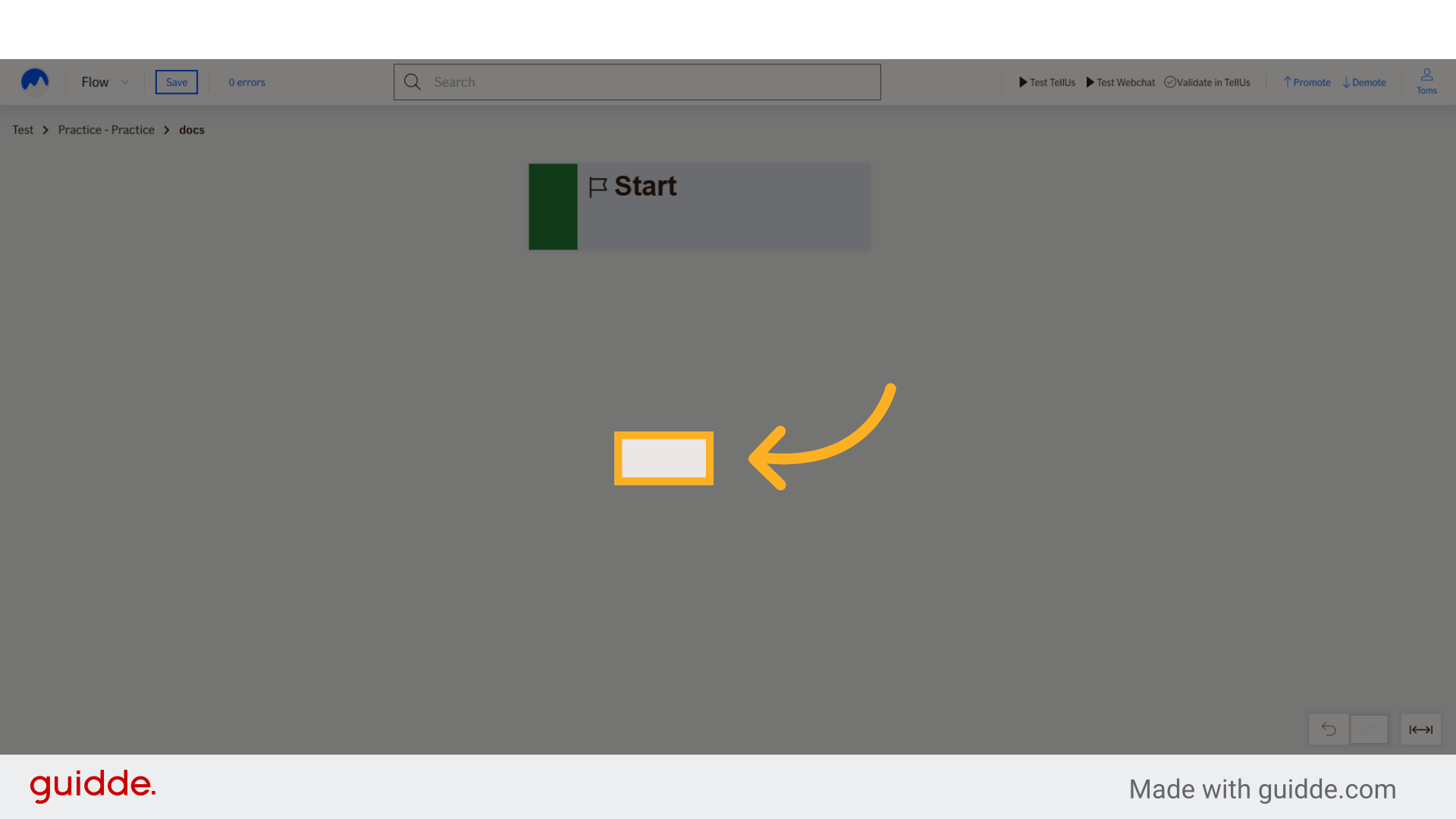
1. Click here
Right-click anywhere to start the process.
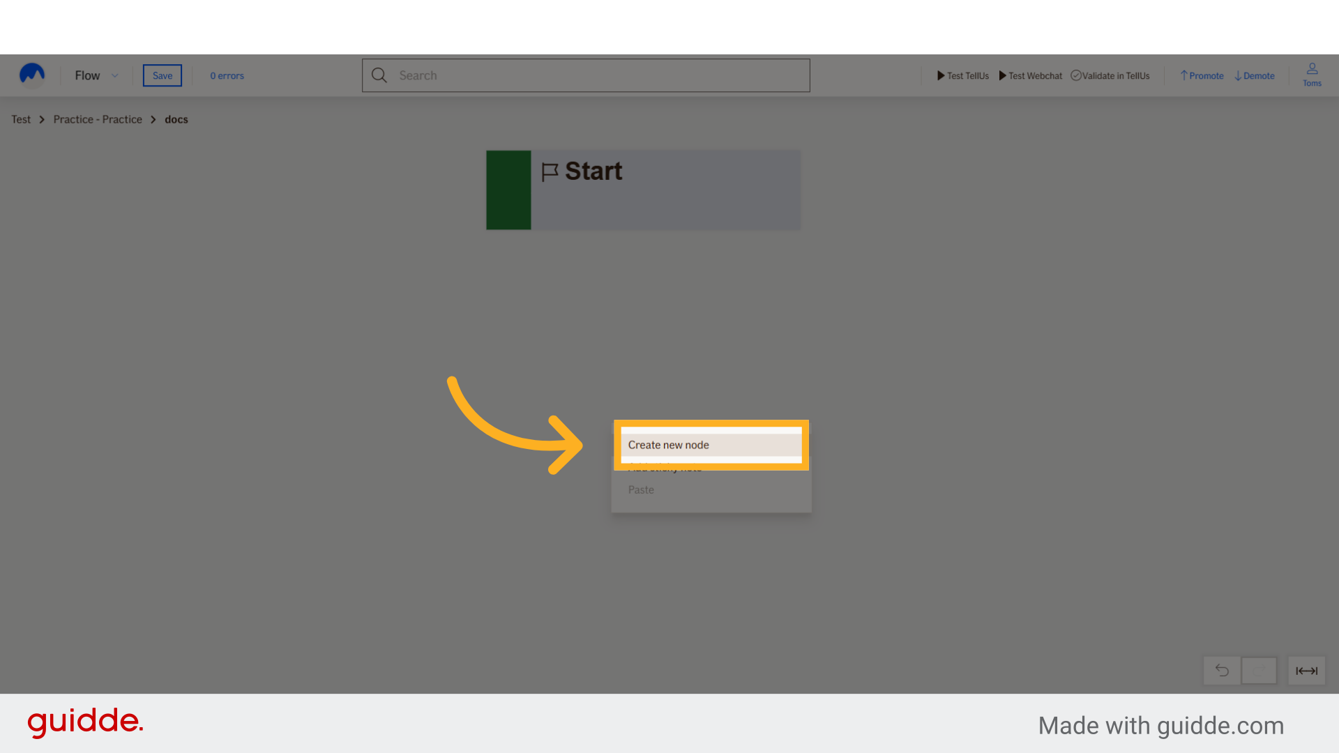
2. Click "Create new node"
Select the option to create a new node.
3. Choose "Generic Input text"
Select the option for a generic input text node.
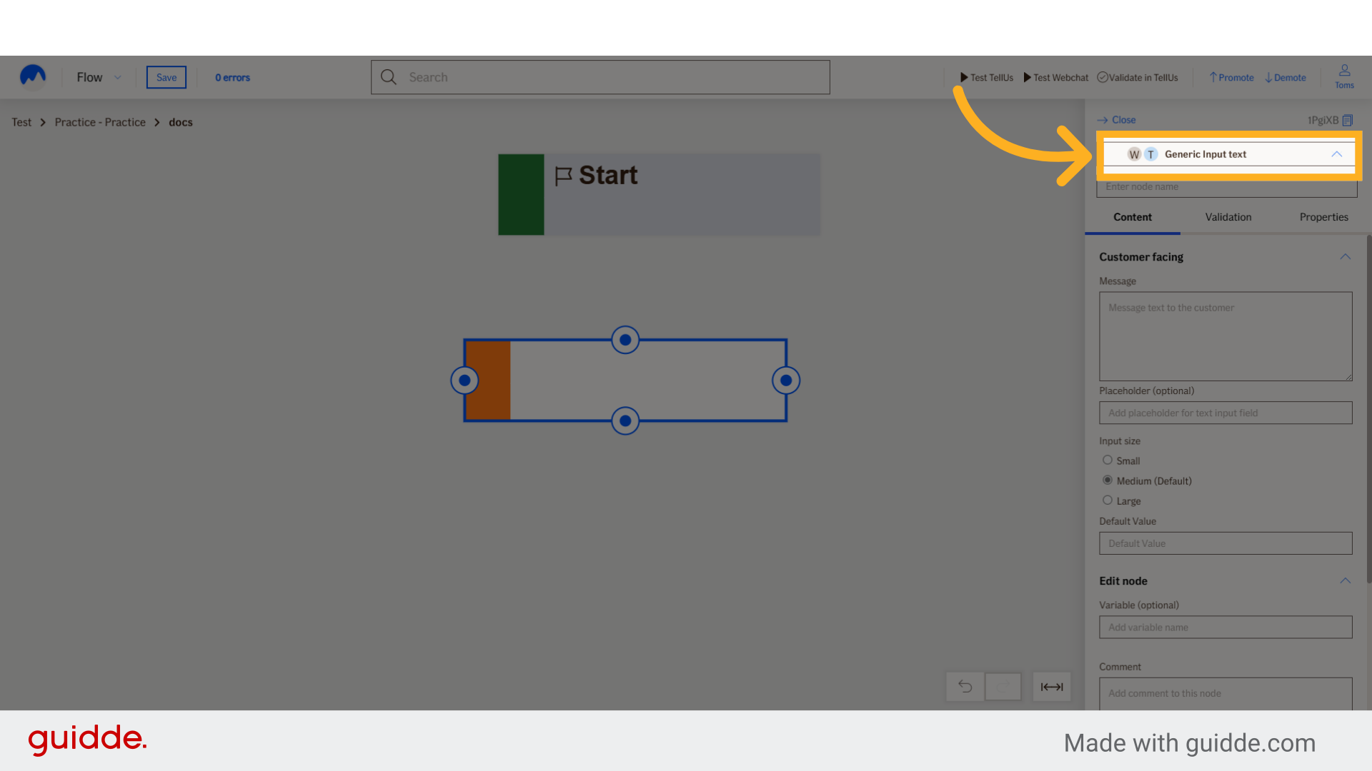
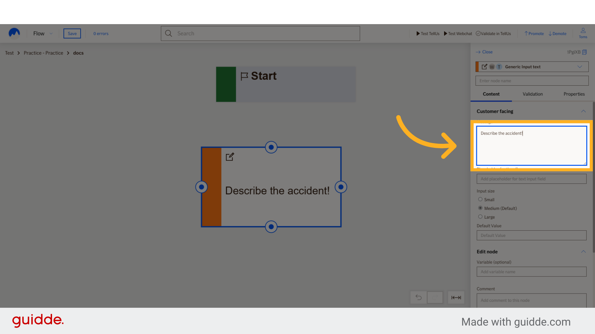
4. Fill user message
Provide a message for the user describing what user should enter.
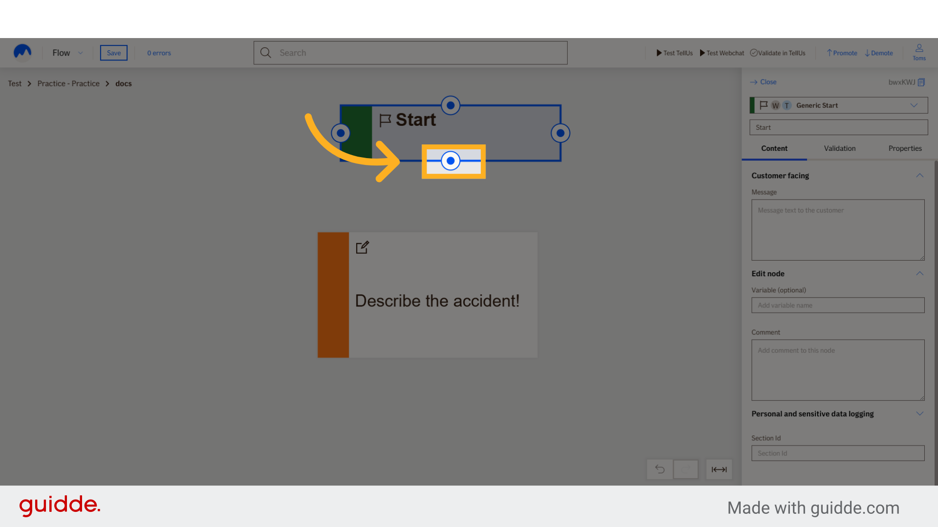
5. Click here
Start node connection
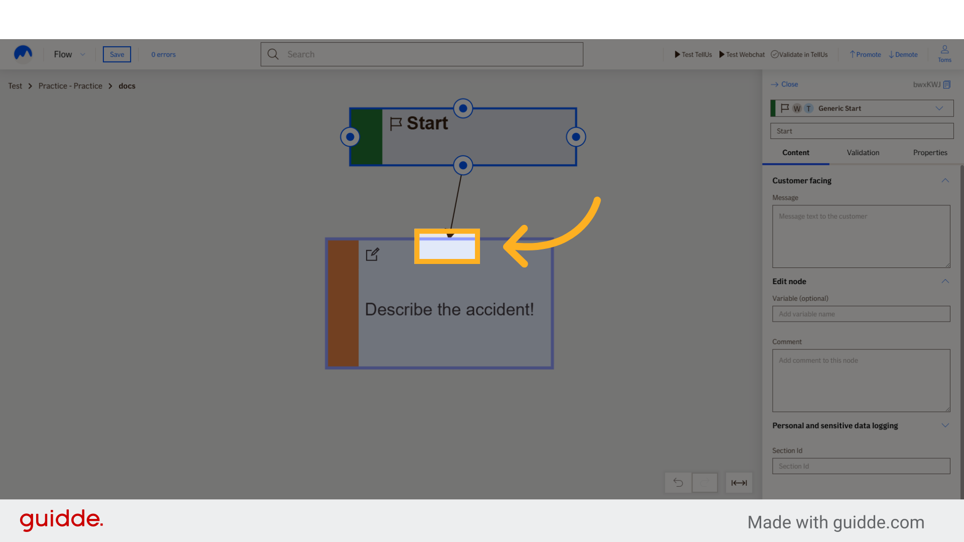
6. Click here
Finish the connection
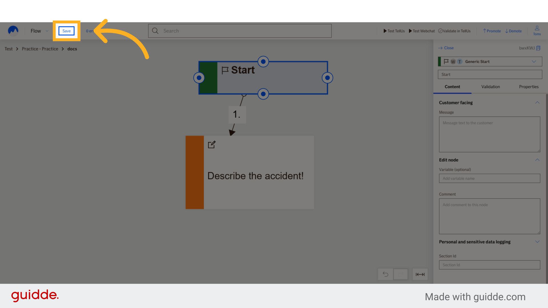
7. Click "Save"
Save the created text input node.
This guide covered the process of creating a text input node in Atlas Editor.