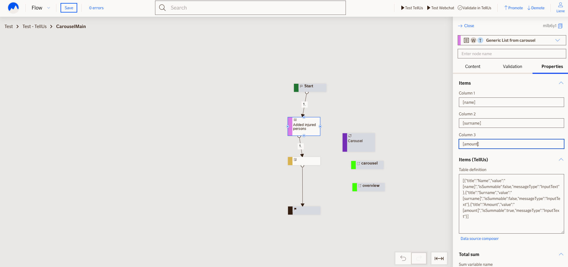
List From Carousel Node
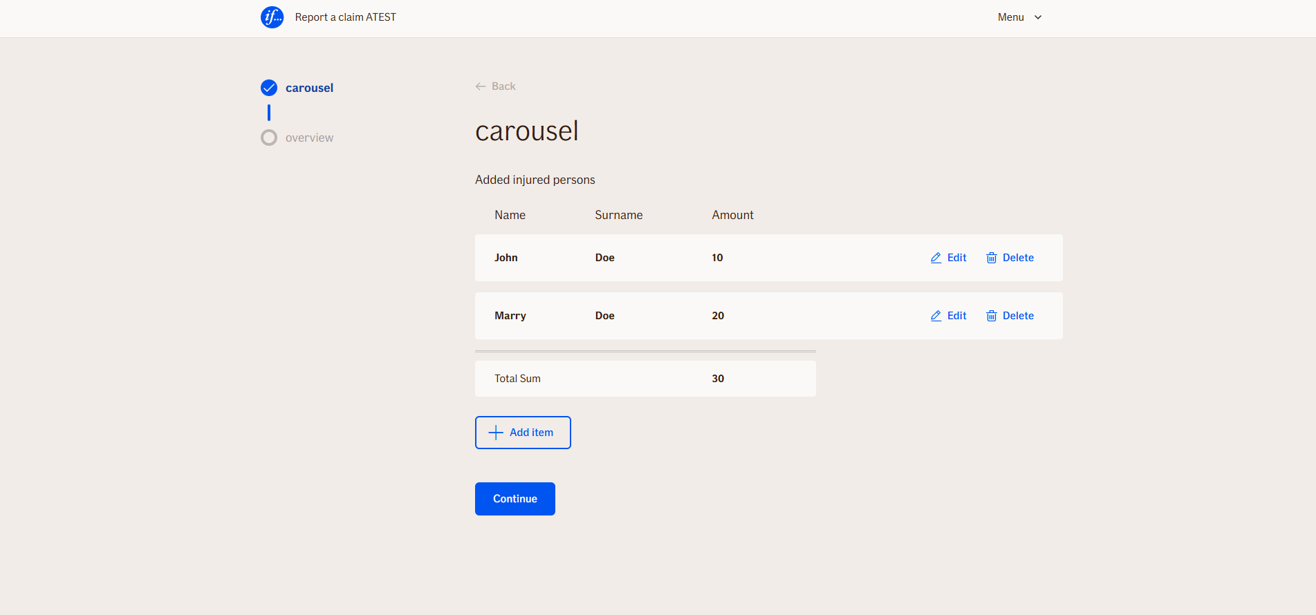
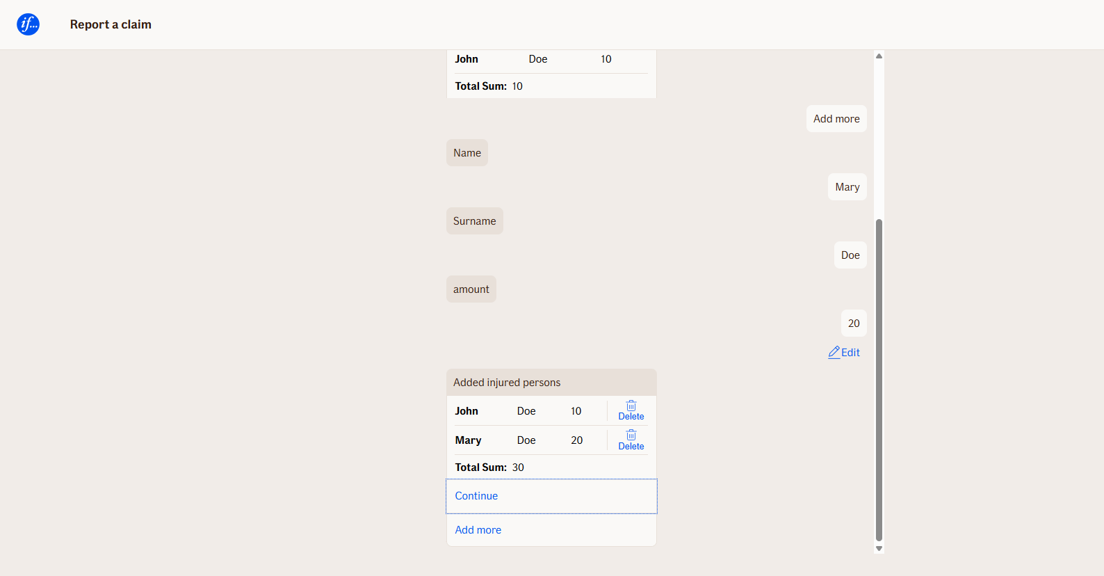
The ListFromCarouselNode takes a group of items you've collected using a Carousel and shows them in a table format. You can:
- Edit any item
- Delete items
- Undo a deletion
- Add new items to the list
Use Case
Use this node if you need to display items from carousel.
UI Examples
- TellUs
- WebChat
Behavior
The node works together with the ContainerNode. First, you need to create the desired logic in a separate file that you want to reuse. Then, add a
carousel node and set the File embedded property to link it to your separate file. After that, use the Carousel Node within the
List from carousel Node to display the item list to the customer by setting the Carousel variable to the appropriate carousel.
How to display item list columns and rows:
In TellUs - use the Items (TellUs) table definition field under Properties, to create a dynamic table definition. This is a Json object and the easiest way to build it is by using Data source composer (linked under the table definition field in the editor).
In the Data composer you can
-
Choose column names
-
Map values to rows
-
Decide whether a column should be summable
-
Set the data type of each column.
-
In Webchat - use the
Items- field under Properties to map up to three columns to specific variables from the container. These will be displayed in the item list table.
Node Metadata
| Property | Description |
|---|---|
| Node class | ListFromCarouselNode |
| MessageType | 23 |
| CanBeEdited | True |
| CanBeProcessedOnce | False |
| RequireUserResponse | Yes |
Input Properties
| Property | Description |
|---|---|
| carouselNodeName | Variable name of carousel node (without brackets). |
| column1 | Variable name of node (with brackets) that you want to display in first column (only Webchat). |
| column2 | (Optional) Variable name of node (with brackets) that you want to display in second column (only Webchat). |
| column3 | (Optional) Variable name of node (with brackets) that you want to display in third column (only Webchat). |
| tableDefinition | Json object of table structure, generated by Data composer. |
| noItemsInListMessage | Error message displayed when no items are added to itemlist.
|
| removeButtonText | Text for button that deletes added item in item list.
|
| undoRemoveButtonText | Text for button that undo delete action of item.
|
| addNewButtonText | Name of the button that user click to add more items to itemlist (only in TellUs).
|
| minItemCount | Minimal count of items customer needs to add.
|
| maxItemCount | Maximal count of items customer can add. |
| minCountErrorMessage | Error message when customer hasn't added minimal count of items and tries to continue the flow.
|
| maxCountErrorMessage | Error message when customer has exceeded maximal count of items and tries to continue the flow.
|
| sumVariableName | Name of the variable of the carousel which needs to be summarized and added to output data (optional) |
| addItemButtons | Name of the button that user click to add more items to itemlist (only in Webchat). |
| continueButtons | Name of continue button (only in TellUs). |
| showTotalSum | Indicator to show or hide total sum at the end of item list. (optional)
|
| totalSumLabel | Lable for total sum (optional).
|
| totalSumUnits | Units in which total sum is calculated that will be placed at the end of total sum value (e.g. currency sign). |
| defaultValidationMessage | The default error message shown when the input is invalid or missing. This is used if no custom validation message is provided.
|
| sectionId | Groups this node visually under a specific section in TellUs. When multiple nodes share the same |
| defaultValue | The initial value that is prefilled into the input field when the node is rendered. Useful for suggesting defaults or pre-populating known data. |
| isRequired | Determines whether the user must provide a value before continuing. If set to
|
| isRequiredValidationMessage | The error message shown when a required field is left empty. This overrides the default validation message when
|
Output Properties
| Property | Description |
|---|---|
| Sum | Total sum value.
|
| Count | Count of item list items.
|
| displayValue | Json object of table definition and values, used in Overview (only in TellUs). |
Editor Example
Try it in the Atlas Editor for TellUs Try it in the Atlas Editor for Webchat
This link opens a prebuilt flow using this node in context. You can inspect how it's configured, how it's connected, and how it behaves in a real editor environment.