Long List Node
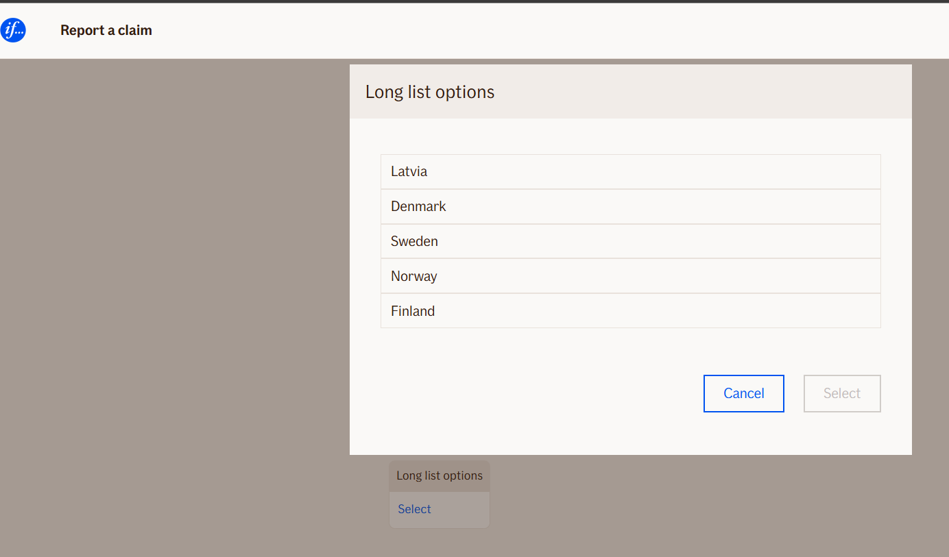
The Long List Node allows users to select one or multiple items from a pre-defined list.
It is ideal for long choice lists where manually adding each option would be impractical. The list is defined via a JSON DataSource object.
To create this structure you should use this tool according to environment:
- https://itest.editor.atlas.ifext.biz/tools/longLists.html
- https://stest.editor.atlas.ifext.biz/tools/longLists.html
- https://atest.editor.atlas.ifext.biz/tools/longLists.html
Only available in the WebChat.
Use Case
Use the Long List Node when:
- You need to provide the user with a large set of selectable options, such as insurance claim types, property categories, or policy codes.
- Creating each choice manually with multiple choice nodes is too cumbersome.
- You want a structured JSON source to generate the UI dynamically.
Example scenarios:
- A claims workflow where users select multiple coverage types from a pre-defined catalog.
- Selecting multiple countries, policy types, or service options.
- Large insurance forms where option lists are maintained externally in Excel and converted to JSON.
Note:
Currently, the Long List Node is limited to basic item selection. Features like categories, ordering, and sub-ordering are not implemented but the JSON structure is prepared for future expansion.
UI Examples
- TellUs
- WebChat
Not applicable.
Behavior
- Blocking: Yes — the user must select according to validation rules to continue.
- Requires user input: Yes.
- If no input is provided: Default validation messages are shown if
isRequiredis true. - Outputs variables: Yes — selected items and codes are stored for use in subsequent nodes.
- Validations enforced: Maximum number of selectable items (
MaxItemsToSelect) and required selection.
Node Metadata
| Property | Description |
|---|---|
| Node class | LongListNode |
| MessageType | 11 |
| CanBeEdited | True |
| CanBeProcessedOnce | False |
| RequireUserResponse | Yes |
Input Properties
| Property | Description |
|---|---|
| Title | Title displayed on the long list modal or popup, guiding the user on what to select. |
| OpenButtonText | Text shown on the button that opens the long list modal.
|
| MaxItemsToSelect | Maximum number of items the user is allowed to select. Set to 0 for a single choice list.
|
| MaxItemsToSelectErrorMessage | Message displayed if the user selects more than the allowed number of items.
|
| DataSource | JSON object defining the list of selectable items. Each item can have a |
| defaultValidationMessage | The default error message shown when the input is invalid or missing. This is used if no custom validation message is provided.
|
| sectionId | Groups this node visually under a specific section in TellUs. When multiple nodes share the same |
| defaultValue | The initial value that is prefilled into the input field when the node is rendered. Useful for suggesting defaults or pre-populating known data. |
| isRequired | Determines whether the user must provide a value before continuing. If set to
|
| isRequiredValidationMessage | The error message shown when a required field is left empty. This overrides the default validation message when
|
Output Properties
| Property | Description |
|---|---|
| Text | Text of the single selected item (for single choice mode). |
| Code | Code of the single selected item (if defined). |
| Texts | Array of selected item texts (for multiple choices). |
| Codes | Array of selected item codes (for multiple choices). |
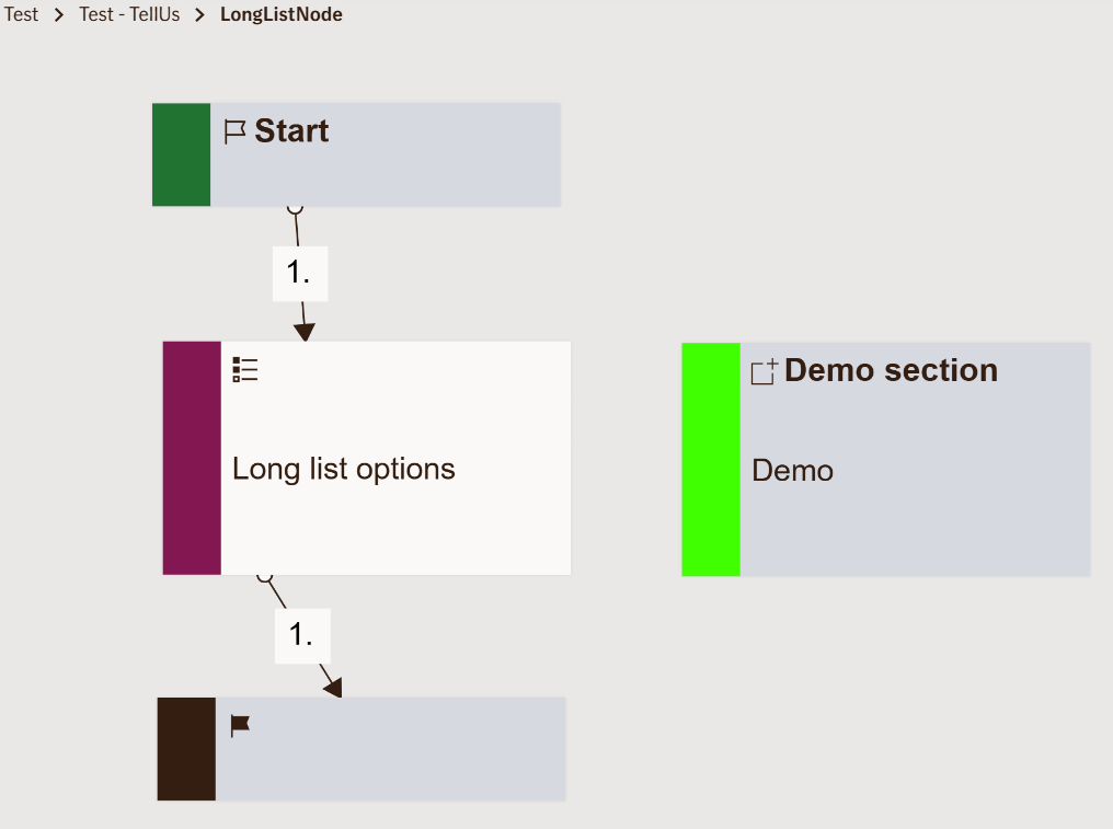
Editor Example
This link opens a prebuilt flow using this node in context. You can inspect how it's configured, how it's connected, and how it behaves in a real editor environment.