Rating Stars Node
The RatingStarsNode displays a message to the user and then waits for a star shaped input response (1 to 5 stars). It is used to collect feedback from the customer.
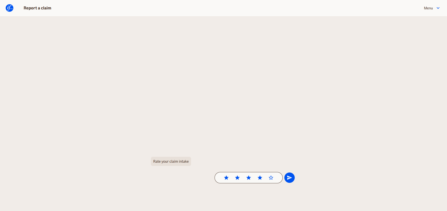
In WebChat, it appears as a chatbot message followed by a star shaped input field. In TellUs, currently, this node type is not implemented and cannot be used. This node is usually placed at the end of the claim report intake, after send data node, so it is optional if customer wants to rate us.
Use Case
Use the RatingStarsNode when you need to collect feedback from the customer.
UI Examples
- TellUs
- WebChat
Behavior
- Blocking: The node waits for the user to type and submit a response
- Produces output: Stores the input in a configured output variable
- Renders differently depending on UI:
- WebChat: message + star shaped input (1 to 5 stars) in the chat stream
- TellUs: not implemented
- Moves to the next node after user submission
Node Metadata
| Property | Description |
|---|---|
| Node class | RatingStarsNode |
| MessageType | 18 |
| CanBeEdited | True |
| CanBeProcessedOnce | False |
| RequireUserResponse | Yes |
Input Properties
| Property | Description |
|---|---|
| submitHint | Submit button hint for Accessibility
|
| ratingHint | Rating hint for Accessibility
|
| defaultValidationMessage | The default error message shown when the input is invalid or missing. This is used if no custom validation message is provided.
|
| sectionId | Groups this node visually under a specific section in TellUs. When multiple nodes share the same |
| defaultValue | The initial value that is prefilled into the input field when the node is rendered. Useful for suggesting defaults or pre-populating known data. |
| isRequired | Determines whether the user must provide a value before continuing. If set to
|
| isRequiredValidationMessage | The error message shown when a required field is left empty. This overrides the default validation message when
|
Output Properties
No output properties.
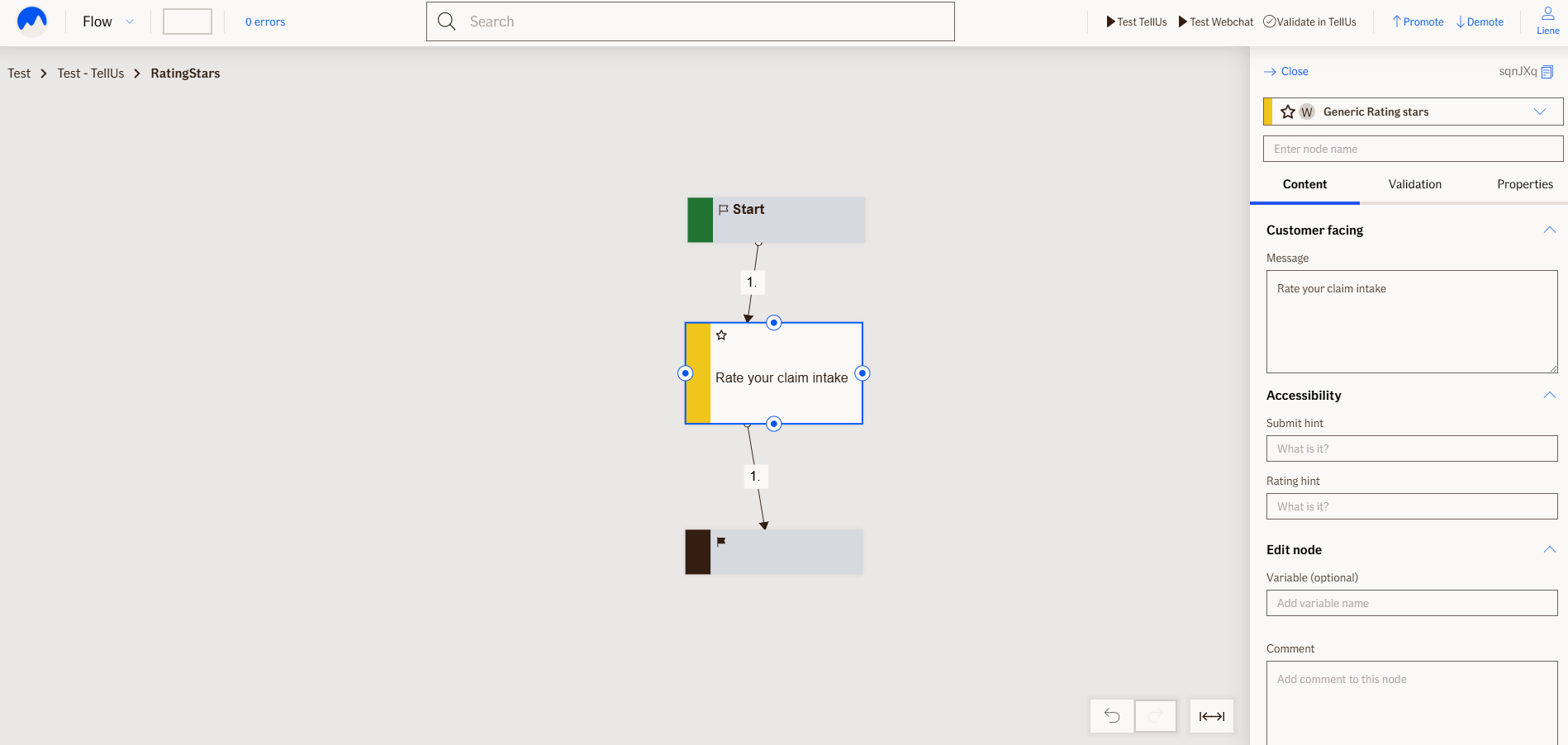
Editor Example
This link opens a prebuilt flow using this node in context. You can inspect how it's configured, how it's connected, and how it behaves in a real editor environment.