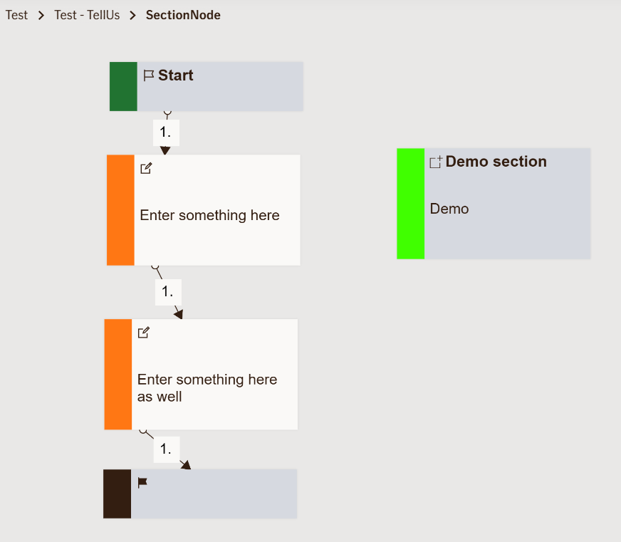
Section Node
Creates a visual section header in TellUs that groups multiple input nodes under a common title.
This helps organize long or complex TellUs forms into clear, logical parts — improving readability and user flow.
Sections are only visible in TellUs (step-by-step forms). The WebChat interface does not display sections.
Use Case
Use this node to structure TellUs flows by grouping related questions together, such as:
- Grouping insurance claim details like "Accident Information" and "Driver Details".
- Organizing multi-step forms such as "Personal Information", "Coverage Options", and "Payment Details".
- Creating a better overview for users filling in long insurance or customer forms.
When not to use:
If you’re designing a WebChat experience, since WebChat does not support section headers.
UI Examples
- TellUs
- WebChat
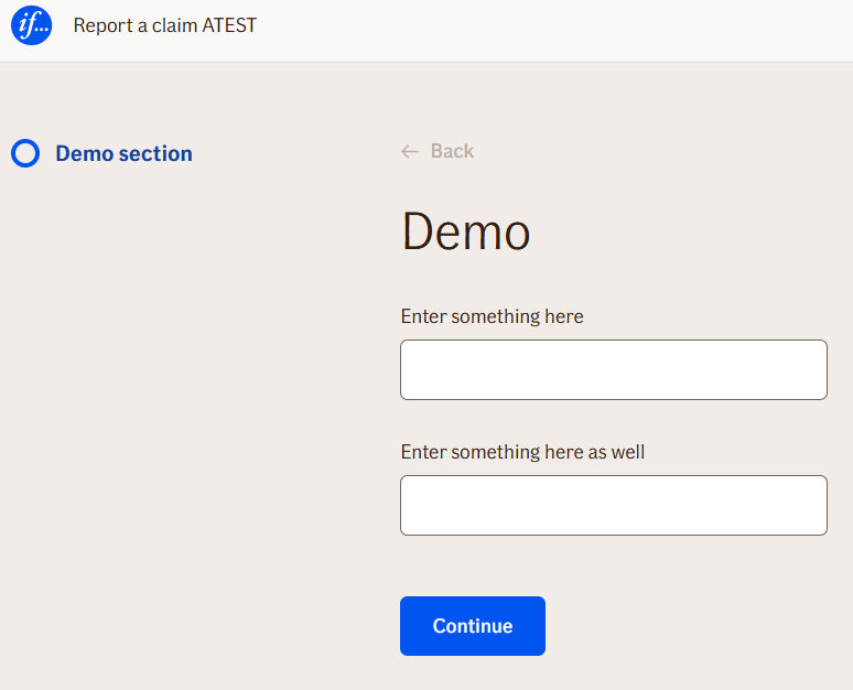
Not applicable.
Behavior
- Blocking: No — the node itself does not stop flow progression; it serves as a grouping element.
- Requires user input: No.
- If no input is provided: Not applicable — SectionNode doesn’t collect input.
- Outputs variables: No direct outputs; it affects layout and grouping only.
- Validations enforced: None — SectionNode is purely structural.
Node Metadata
| Property | Description |
|---|---|
| Node class | SectionNode |
| MessageType | 13 |
| CanBeEdited | False |
| CanBeProcessedOnce | False |
| RequireUserResponse | YesWithoutAwaiting |
Input Properties
| Property | Description |
|---|---|
| continueButtonText | Defines the label text for the continue button shown at the end of the section. This is useful if you want to give users a clear action cue before moving to the next section.
|
| hideNavigation | Determines whether the default TellUs navigation (e.g., continue/back buttons) is hidden for this section. Can be used to create non-interruptive visual groupings without user navigation.
|
| isDeadEnd | If set to true, the flow will stop after this section. This is typically used when the section is intended as the final step or informational endpoint.
|
| defaultValidationMessage | The default error message shown when the input is invalid or missing. This is used if no custom validation message is provided.
|
| sectionId | Groups this node visually under a specific section in TellUs. When multiple nodes share the same |
| defaultValue | The initial value that is prefilled into the input field when the node is rendered. Useful for suggesting defaults or pre-populating known data. |
| isRequired | Determines whether the user must provide a value before continuing. If set to
|
| isRequiredValidationMessage | The error message shown when a required field is left empty. This overrides the default validation message when
|
Output Properties
No output properties.
Editor Example
This link opens a prebuilt flow using this node in context. You can inspect how it's configured, how it's connected, and how it behaves in a real editor environment.