Show Policies Node
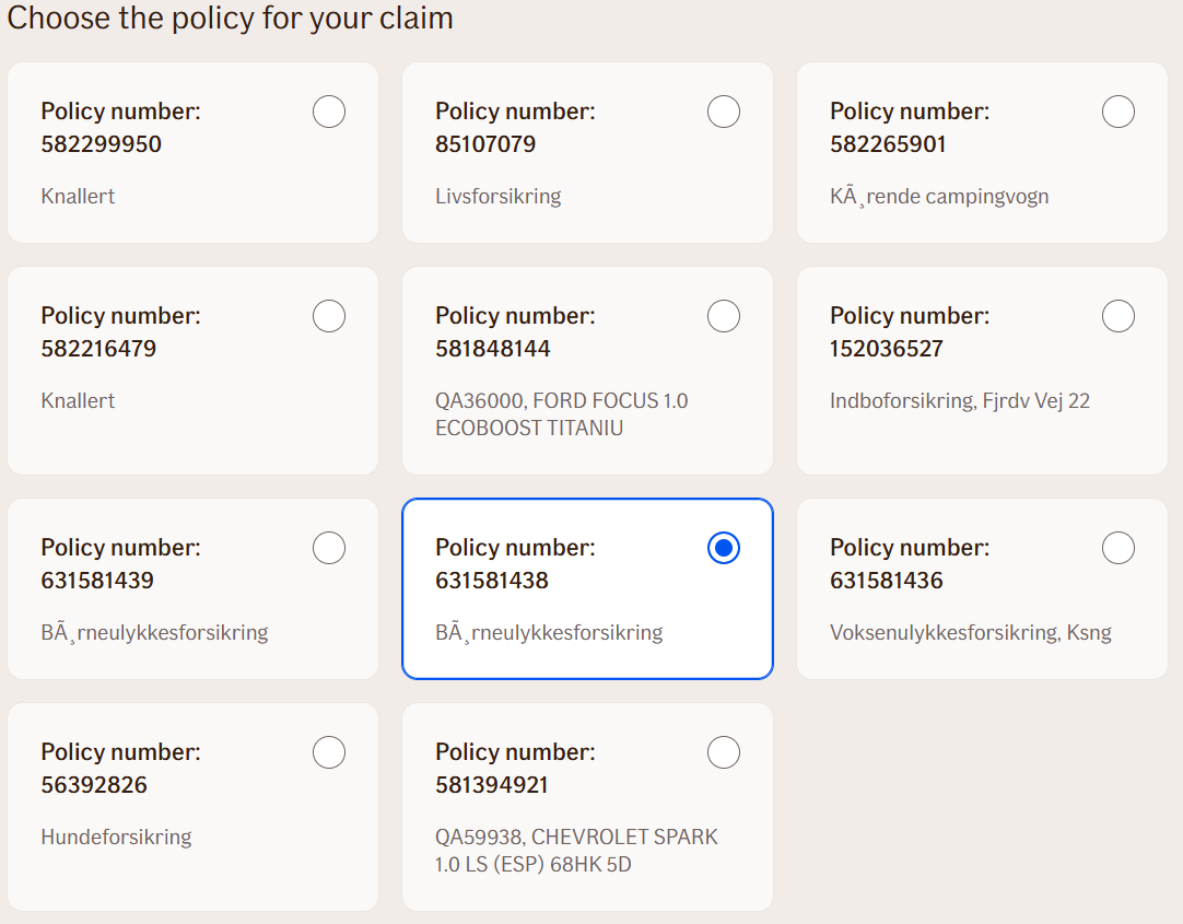
In TellUs, displays private policies from a policy search as choices for the user. After a policy is selected, its details are available as flow outputs for later steps.
Use Case
Use this node in TellUs after Get Policies when a customer has more than one private policy and needs to identify which policy relates to their claim or request. The node presents the matching policies for selection, then makes the selected policy's details available to later flow steps.
TellUs UI Example
Behavior
Use this node after Get Policies to let the user choose a policy from the search results. Connect the Get Policies node's policyData output to this node's policyData input.
The node reads the policy list and presents policies with a Private business area as selectable choices. Each choice uses the configured policy display text followed by the policy number. Supporting text varies by claim area: it can show vehicle details, the insured property, insured objects, or the product name.
The user must choose an available option. When the user selects one of the listed policies, the node writes that policy's details to its outputs. No policy outputs are written if no listed policy is selected. Empty or invalid policy data produces no choices.
Additional value details configured for the node are appended to the policy details. Policy choices are displayed in bold.
Node Metadata
| Property | Description |
|---|---|
| Node class | ShowPoliciesNode |
| MessageType | 68 |
| CanBeEdited | True |
| CanBeProcessedOnce | False |
| RequireUserResponse | Yes |
Input Properties
| Property | Description |
|---|---|
| ValueDetails | Optional additional value details to display alongside the policy choices. These are added after the details generated from each policy. |
| isBold | Controls whether the choice text is bold. The current implementation displays the policy choices in bold.
|
| policyDisplayText | Text shown before each policy number in the choice label. The final label is this text, a space, and the policy number. The default label is localized by language.
|
| policyData | The serialized policy list to display. Connect this to the |
| defaultValidationMessage | The default error message shown when the input is invalid or missing. This is used if no custom validation message is provided.
|
| sectionId | Groups this node visually under a specific section in TellUs. When multiple nodes share the same |
| defaultValue | The initial value that is prefilled into the input field when the node is rendered. Useful for suggesting defaults or pre-populating known data. |
| isRequired | Determines whether the user must provide a value before continuing. If set to
|
| isRequiredValidationMessage | The error message shown when a required field is left empty. This overrides the default validation message when
|
Output Properties
| Property | Description |
|---|---|
| policySystem | The policy system of the policy selected by the user. Populated only when a listed policy is selected. |
| policyNumber | The policy number selected by the user. Populated only when a listed policy is selected. |
| productName | The product name of the policy selected by the user. Populated only when a listed policy is selected. |
| type | The policy type of the policy selected by the user. Populated only when a listed policy is selected. |
| insuredObjectName | The name or description of the insured object for the selected policy. Populated only when a listed policy is selected. |
| insuredObjectType | The type of insured object for the selected policy. Populated only when a listed policy is selected. |
| businessArea | The business area of the policy selected by the user. This node only displays policies with the |
Editor Example
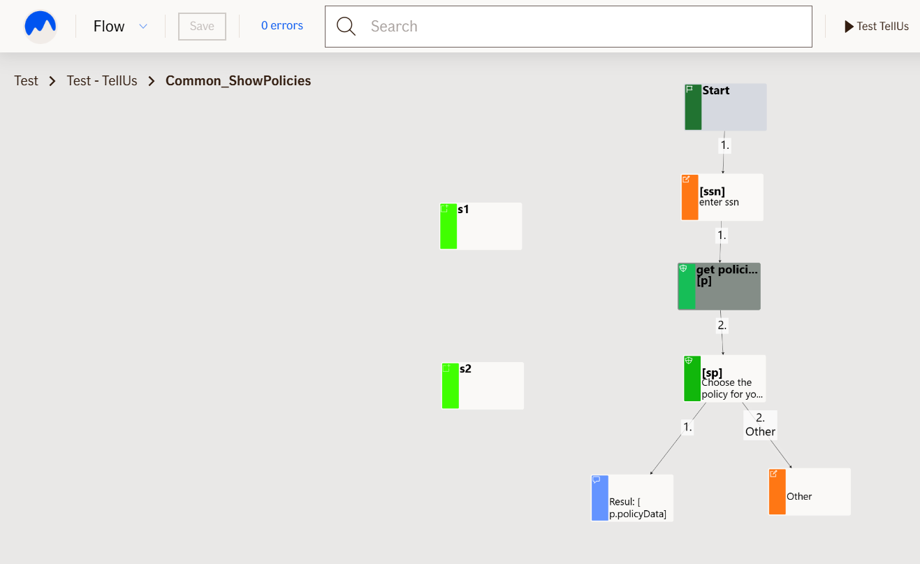
This link opens a prebuilt flow using this node in context. You can inspect how it's configured, how it's connected, and how it behaves in a real editor environment.