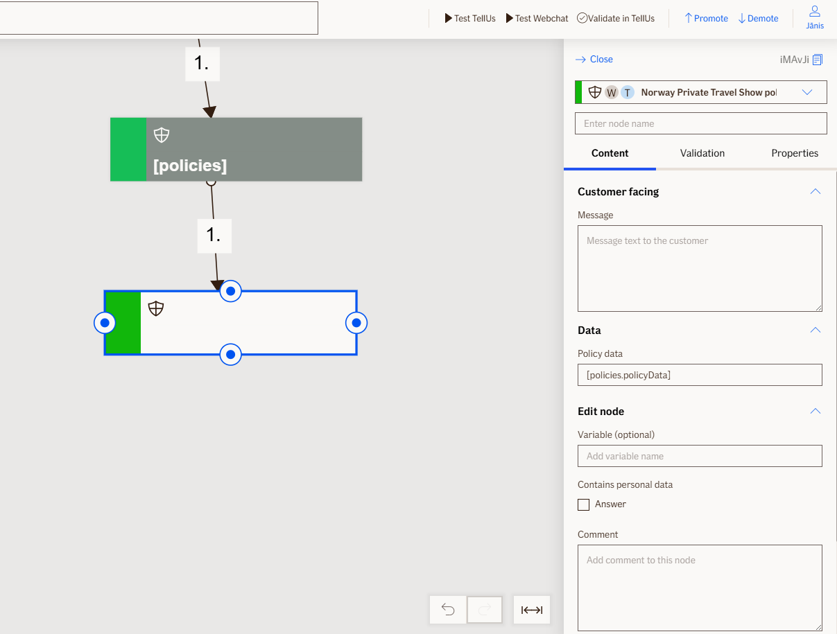
Show Policies Node
The Show Policies node displays a list of available travel insurance policies to the user as selectable choices. When a user selects a policy, the node captures and stores the policy details for use in subsequent nodes.
Use Case
Use the Show Policies node when you want to:
- Present a list of available travel insurance policies for the customer to select from.
- Allow the customer to choose a specific policy to view details or process a claim.
- Display policies after they have been retrieved by the
Get Policiesnode.
Don't use it when:
- The policy list is empty or unavailable; verify policies are available before displaying this node.
- You need to display policies without requiring user selection.
UI Examples
- TellUs
- WebChat
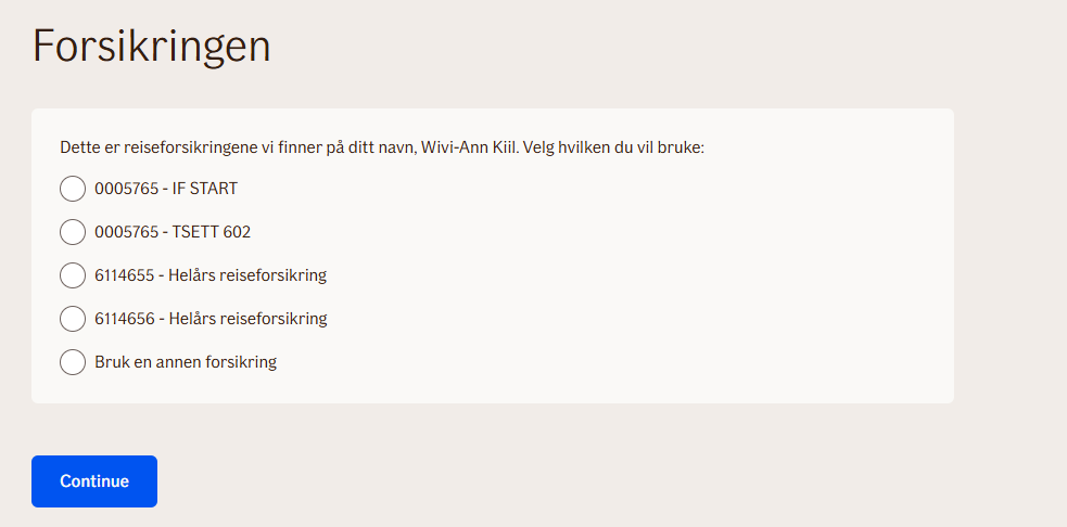
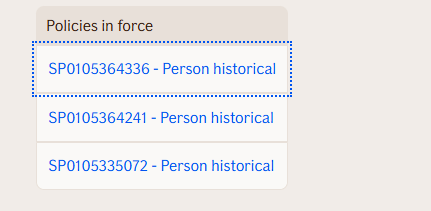
Behavior
- Blocking: the flow pauses until the user selects a policy from the list.
- Requires input: expects travel policy data from the
Get Policiesnode passed via thePolicyDataproperty. - Produces output: stores the chosen policy object and individual policy properties (policy number, policy type, coverage type, product name, etc.) in the value bag.
- Renders: displays a list of policies as selectable choices in the UI.
- Validation: ensures the user selects a valid policy from the available options.
- Output handling: logs access data for each policy displayed; returns the chosen policy details for use in subsequent nodes.
Node Metadata
| Property | Description |
|---|---|
| Node class | ShowPoliciesNode |
| MessageType | 122 |
| CanBeEdited | True |
| CanBeProcessedOnce | False |
| RequireUserResponse | Yes |
Input Properties
| Property | Description |
|---|---|
| policyData | Policy data object. |
| defaultValidationMessage | The default error message shown when the input is invalid or missing. This is used if no custom validation message is provided.
|
| sectionId | Groups this node visually under a specific section in TellUs. When multiple nodes share the same |
| defaultValue | The initial value that is prefilled into the input field when the node is rendered. Useful for suggesting defaults or pre-populating known data. |
| isRequired | Determines whether the user must provide a value before continuing. If set to
|
| isRequiredValidationMessage | The error message shown when a required field is left empty. This overrides the default validation message when
|
Output Properties
| Property | Description |
|---|---|
| policyType | The type of the selected travel policy. |
| chosenPolicy | The travel policy selected by the user. |
| policyNumber | The policy number of the selected policy. |
| personType | The type of person the selected policy covers. |
| productCode | The product code for the selected travel insurance product. |
| productName | The name of the selected travel insurance product. |
| policyHolderSsn | The social security number of the policy holder. |
| policyHolderCustomerNumber | The customer number of the policy holder. |
| coverageType | The type of coverage provided by the selected policy. |
| productArea | The product area classification for the selected policy. |
| productSubCode | The sub-code classification for the selected travel insurance product. |
Editor Example
This link opens a prebuilt flow using this node in context. You can inspect how it's configured, how it's connected, and how it behaves in a real editor environment.